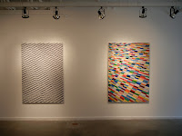
Comments/Context: German photographer Roland Fischer takes the idea of abstraction based on architectural forms to its logical end point extreme. Fragments of modern buildings are flattened, tightly cropped, and rendered scale-less (is this an entire facade or a tiny detail?), becoming exercises in colorful geometric patterning. Printed large and given a now familiar glossy object quality, they seem to drift away from the conventional photographic discourse, echoing Mondrian and Richter in their crisp, formal stripes and grids.
This method of abstraction is not, of course, new; we can go back to Barbara Crane and Harry Callahan or look to more contemporary work by Ola Kolehmainen to see this line of thinking being explored or to see echoes of similar pictures. Where I think Fischer has gone further is that in many cases, he has even removed surface depth and texture from the equation, truly paring the forms down to elemental two dimensional shapes; it is often difficult to ground these images in the context of "buildings" or to place them in some kind of recognizable physical reality. The scale of the works confuses this further, as "big" and "small" lose their relational meaning.

This method of abstraction is not, of course, new; we can go back to Barbara Crane and Harry Callahan or look to more contemporary work by Ola Kolehmainen to see this line of thinking being explored or to see echoes of similar pictures. Where I think Fischer has gone further is that in many cases, he has even removed surface depth and texture from the equation, truly paring the forms down to elemental two dimensional shapes; it is often difficult to ground these images in the context of "buildings" or to place them in some kind of recognizable physical reality. The scale of the works confuses this further, as "big" and "small" lose their relational meaning.

The more Fischer pushes away from typical photographic norms, the more these works drift toward a concrete connection to Hard Edge, Color Field, and Geometric painting and even Op Art; their original underlying photographic truth becomes insignificant, and we are forced to focus on the purity of the forms, regardless of their origin. Yes, these are architectural facades, but in each case, Fischer has sliced off a thin top layer and transformed it into a strict study in color and pattern.
Read full review @ DLK COLLECTION
Read full review @ DLK COLLECTION


No comments:
Post a Comment