VON LINTEL GALLERY

Thursday, February 28, 2013

DANA MELAMED | Feat. Artist @ The America-Israel Cultural Foundation


"Aggression has been an ongoing theme in my work—both among people and between humanity and nature. Humans strive to build and to civilize, struggling against the perpetual growth and decay of the natural world. At the same time, human progress often comes at the expense of the environment. My interest in this conflict is reflected in my choice of materials and motifs and in the techniques that I employ. 

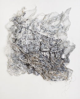
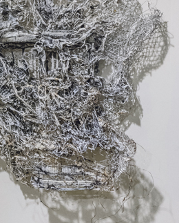
I compose my work layer upon layer, starting with a patched-together aluminum mesh base. The irregular surface of the mesh forms an imagined topography. The pieces grow organically, building up from this surface, as I attach drawings of powers sources, man made and natural found objects, and constructed architectural forms. 

The hanging tendrils that weave in and out of the layered surface and dangle beyond its boundaries suggest veins and plant life as well as mechanical infrastructure, reflecting our competition with the environment for resources. I often use imagery relating to the engine in my work as both a symbol of great achievement in human history and of disastrous destruction. Showing engines overgrown with vines also suggests the on-going struggle between human innovation and nature. 

 Fire was the first element that allowed humans to significantly change their environment. It enabled us both to create and to destroy. I use fire, in the form of a blowtorch, to alter my materials and to fuse one to another. I think of the blowtorch as a paintbrush that makes unique marks on each surface. The unpredictable and sometimes destructive force of fire reflects the power of nature, introducing an element of chance into my artistic process."

— Dana Melamed 

Read more @ The America-Israel Cultural Foundation

Tuesday, February 19, 2013

DANA MELAMED | Duality of Matter - Opening Reception Thurs Feb 28, 6—8 PM


Von Lintel Gallery
Dana Melamed, Engine 3.2, 2012
transparency film, cinefoil, paper, pencil shavings,
recycled industrial components, acrylic paint, ink,
charcoal, and wire on aluminum mesh
18 x 19 x 3 inches
DANA MELAMED | Duality of Matter

February 23 — April 13, 2013
Opening Reception Thurs Feb 28,  6—8 PM

Von Lintel Gallery is pleased to announce Duality of Matter, an exhibition of new work by Israeli artist Dana Melamed.


In her latest body of work, a series of wall-mounted sculptures, Melamed presents haunting urban landscapes that explore the struggle between humanity and nature. The abandoned environments are littered with the twisted metal of urban decay under violent skies. The intricate and three-dimensional crevices, caverns, stairwells, and passageways can be explored endlessly, yielding a new discovery with each viewing. Tangled vines threaten to envelope the crumbling architecture, reminding us of our tenuous hold on the constructed environment. While humans strive to build and to civilize, often causing harm in the name of progress, nature continues its perpetual cycle of renewal.


Von Lintel Gallery
Detail
Melamed's work grows organically, building up from the surface of an irregular aluminum mesh. She combines found natural and manmade elements with drawings and sculpted architectural forms. Each piece is developed layer upon layer with paint and glue, agitated with razors to distort and obscure the images, and fused with a blowtorch. Melamed relates her aggressive techniques and the use of both mechanical and organic materials to the conflict between people and the environment. Her layered and repeated process of drawing, painting, building, carving, scraping, and burning also recalls the growth and subsequent destruction essential to our relationship with nature. 


DANA MELAMED | Selected Works

 Dana Melamed
Disrupted Barrier, 2012
transparency film, cinefoil, paper, acrylic,
charcoal, and wire on aluminum mesh
40 1/2 x 33 1/2 x 6 inches


 Dana Melamed
Disrupted Barrier (Detail)

 Dana Melamed, Duality, 2012
transparency film, cinefoil, paper, acrylic, charcoal,
and wire on aluminum mesh
39 1/2 x 29 1/2 x 9 1/2 inches

 
Dana Melamed, Engine 3.4
Engine 3.4, 2012 transparency film, cinefoil, paper,
crylic, charcoal, and wire on aluminum mesh
23 x 23 x 3 1/2 inches
 Dana Melamed
Engine 3.3, 2012
transparency film, cinefoil, paper, pencil shavings, 
recycled industrial components, acrylic paint,
ink, charcoal, and wire on aluminum mesh
21 1/2 x 19 x 4 1/2 inches

 Dana Melamed, Second Order Friction, 2012
transparency film, cinefoil, paper, acrylic, charcoal,
and wire on aluminum mesh
35 x 45 x 6 inches

 Dana Melamed, Second Order Friction (Detail)

Dana Melamed, Error Shift Pattern, 2013
transparency film, cinefoil, paper, acrylic, charcoal,
and wire on aluminum mesh
40 1/2 x 41 x 10 inches

DANA MELAMED | Selected Press


DANA MELAMED | Biography


Dana Melamed Biography

Born in Israel, 1972


Lives in New Jersey, works in New York


Dana Melamed Solo Exhibitions


2013

Duality of Matter, Von Lintel Gallery, New York, NY


2012

Durst Organization, Conde Nast Building, New York, NY


2011

Transforming Voids, Lesley Heller Workspace, New York, NY


2010

Black Tide, Priska C. Juschka Fine Art, New York, NY


2008

Rhetoric of Violence and Trauma, Durst Organization, New York, NY


2007

Into the Vortex, Priska C. Juschka Fine Art, New York, NY


2006

When Dawn Breaks, Priska C. Juschka Fine Art, New York, NY


Dana Melamed Selected Group Exhibitions


2012

Suspended Disbelief, Von Lintel Gallery, New York, NY


2010

Fire Works, curated by Mary Birmingham, Hunterdon Art Museum, Clinton, NJ
One Thousand and One Nights: the narrative tradition in contemporary Middle Eastern art, curated by Nancy Einreinhofer, William Paterson University, University Art Galleries, Wayne, NJ
Skeptical Landscapes, Herter Gallery, University of Massachusetts, Amherst, MA


2009

Sustainable?, Chen Gallery, Central Connecticut State University, New Britain, CT


2008

183rd Annual Exhibition of Contemporary Art, National Academy Museum, New York, NY
Remarks on Color, Galerie Baer, Dresden, Germany

Future Tense: Contemporary Views/Post-Utopian Landscape, Neuberger Museum of Art, Westchester, NY

Lost Horizon, curated by David Gibson, Herter Gallery, University of Massachusetts, Amherst, MA


2006

Go North, New Yorker!, Peekskill Project 2006, Hudson Valley Center for Contemporary Art, Peekskill, NY

Frames Of Mind, The Bernnan Gallery at the Justice William Bernnan Court House, Jersey City, NJ


2005

New Found Land: An Inaugural Group Show, Priska C. Juschka Fine Art, New York, NY

Small Matters of Great Importance, Edward Hopper House, Nyack, NY

The Reasonably Straight Digital Photography Show, Old Church Art Center, Demarest, NJ

Cooper Union Residency Cooper Union, New York, NY


Dana Melamed Bibliography


2010

Shuster, Robert. "Fall Guide: Ingrid Calame Finds Beauty in the Grime." Village Voice,
September 1, 2010.


2008

Genocchio, Benjamin. "Today's Landscapes, Tomorrow's Dystopia," The New York Times, June 1, 2008.

Rosenberg, Karen. "Where Have All the Paintings Gone? To the National Academy," The New York Times, May 30, 2008.

Neil, Jonathan T. D. "Special Focus: Reviews Marathon." Art Review, no. 19, February 2008, 82.


2007

Wright, Jeffrey. "The Perennial Allure of Allegorical Black and White." Chelsea Now, vol. 2, no. 8, 2007.


2006

Chambers, Christopher. "July & August Picks." NY Arts Magazine, July 2006.

Baker, R.C. "Dana Melamed," The Village Voice, February 2006.

Melamed Solo Exhibit is slated for New York City," Northern Valley Suburbanite, February 2006.

"Dana Arises," Yedioth Aharonoth, February 2006.


Dana Melamed Public Collections


Frenkel Foundation for the arts, MI


Dana Melamed Residencies


2005

Cooper Union, International Emerging Artists Residence, New York, NY


Dana Melamed Education

1995

Tel Aviv Art Design Center and Tel Aviv School of Visual Art (Vital) – Fine Art


1990

Architectural Rendering and Drafting, concentration on Art and Architecture History, Ort Technicum, Givatayim, Israel


Saturday, February 16, 2013

MELANIE WILLHIDE | Featured on Saint Lucy


Melanie Willhide


Melanie Willhide grew up in Connecticut, attended the very East Coast schools of RISD and Yale.  She moved to Los Angeles in 2004.  She brought her sophisticated awareness of art history to this land of illusions and has proceeded to make a very distinct body of photographic work.  Her images are rooted in the discourse of photography; it’s concerns with memory, authenticity and narrative.  Yet she does not appear to be burdened by that history, her manipulation of surface, content and context serve to create images that are rooted in photographic specificity yet are as mysterious as they are formally rigorous. This interview was conducted via email in January / February 2013.

MAD:  What was your conception of photography when you were an undergraduate at RISD? I am interested in how young artists come to their medium and how their ideas of it change when they begin to study it seriously.

MW:  Honestly, my relationship with the medium has been fickle at best. Photography and I have a dynamic of classic demand withdrawal: I ignore it and it wants me – I give it attention and it ignores me. But every once and a while we are able to make it work. This was apparent back in my earliest attempt to commit to the medium. I applied to RISD with photographs, but instead of enrolling in the photo department I initially enrolled as a fashion major. While at RISD I tended to mix the two mediums (fashion/fabric arts and photo) in my work. I made photographs to convert into fabric – or used fabric to create objects to photograph. I created patterns for my photographs based on traditional pattern-making techniques, and made wounds out of fabric and photographed them. In these early years I exhibited primarily in an installation format. Eventually I moved over to the photography department. Later in my graduate program at Yale I felt there was little room for anything but the practice of straight photography. So in a way graduate school forced me to really engage with my photography. I used the time to learn the technical craft of lighting and large format. This was the only time I thought of myself as a straight photographer. This period radically focused my work, and since then two concerns have dominated my work: a dedication to making the image disappear in the photograph, and the desire to challenge perceptions of the photograph through digital manipulation.

MADI really like your early series Augmented Sixth. I know very little about music theory but isn’t an augmented sixth a dissonant chord?  It certainly seems appropriate for the sense of isolation I feel from the images in that series.  Also, I was wondering if you were at all influenced by Eileen Cowin’s work from the 1980s? Do you know those kind of ersatz soap opera images in which she sets up her family in friends in melodramatic scenes?


Melanie Willhide, ‘Sleeper Hold’ c-print
20×24″
from ‘Mimic’, 2001
,MW:  I know Eileen’s work very well – and yes it was extremely influential. Funny you should ask, because she was the first person to give me a teaching job in California when I moved to LA from NYC in 2004. My mother studied music in college, voice and classical guitar. She was a great influence to me and to this series. The title was homage to her and our time together as a family. Our family dynamic was unfixed, poetic, and challenging. My goal with Augmented Sixth was imaging the familiarity of family in a baffling, unnerving, and elusive way.  Life moves so quickly that, when you are able to identify the most fundamental parts, they are already in the process of being erased. So that work attempts to define my past by investigating the temporal distance between seeing and knowing. Photo lends itself beautifully to this space – and Eileen is a master of that territory.
MADThe basic gesture of photography is to point at something to say ‘Look at this!’ In other words, the photograph is a window to things in the world. In addition to this, your work points to photography itself.  With early projects like Augmented Sixth and Men, ideas of presence, what is inside and outside the frame are important.  In later projects such as Sleeping Beauties and Belt of Venus you investigate the materiality of photography and in doing so raise questions about the longing and nostalgia that often fuels our relationship to photographs.  Am I misinterpreting or are these issues important to you?

Melanie Willhide, ‘For Spite’
c-print, 24” x 30”
from ‘Sleeping Beauties (The Box Under the Bed)’, 2006

MW:  No you are not misinterpreting these issues as being important to me. I do agree that the early projects placed particular importance on what was not included in the frame. But the later works for me deal more with perception than nostalgia. In both my series Sleeping Beauties (the box under the bed) and The Belt of Venus, I intentionally create work where it is challenging to discern whether the image is authentic or fabricated by showing both the front-side and the backside of the image simultaneously. This layering creates a time lapse (much in the way abstract painting can) between initial sight and ultimate recognition.

Every part of these images is premeditated, including the front-side imagery and the notes and messages scrawled on the backside. There are hints that these are artificial artifacts in the production. Yet despite the use of recent technology to create something that looks antiquated, viewers are able to tap into the common human experience of the photographic image as memorial to a past love.  This is where I think nostalgia can be read into the work. Yet in reality they are devoid of any real experience or real information. They mimic the experience of an image found in a flea market, in which both the image and the text on the backside leave you puzzled as they perhaps fail to define either the subject of the image or the one who owned it. Inspiring these questions is, for me, the most exciting part of working digitally.

In my recent series To Adrian Rodriguez with Love, I simulate (with Photoshop) the language of the corrupted file. With Adrian, the work shifts the concern from the authenticity of an image’s subject to the image as a whole. Here the aesthetic language is more direct; the audience sees the image as well as its illusion (or the result of the failure of Photoshop’s mathematics) at the same time. To use your words – this series show the materiality of the photograph, as well as a nostalgia-inducing illusion.


Melanie Willhide, ‘Beefcake and Betsy’
archival pigment print 28×30″
from To Adrian Rodriquez with Love’, 2011
 
MAD:  Speaking of, your series To Adrian Rodriguez with Love, has received a lot of critical attention, deservedly so.  There is an almost mythical story about how the series came about. Do you mind retelling it here and then maybe talk about the moment in which you realized your loss could be an opportunity?  Perhaps it is still too early to tell, but did making this work change your trajectory as an artist?

MW:  My husband and I bought our first house in Altadena, California—a small town at the base of a state forest, above Pasadena—where cowboys and Cal tech professors live. I left for the day to manage the production of a commissioned piece for another artist in Los Angeles. When I returned to the house, it had been broken into. Items taken: two computers (including mine from my studio), a gold locket, a flat screen TV, and (to the haters) my backup airport.

I spent the next month dealing with a specific set of noteworthy characters at the Altadena Sherriff’s Department: one with a cast painted green with a black happy face drawn boldly on it, as well as some who appeared busy with things like whether or not to take a sweatshirt with them outside. All of them seemed to be eating sandwiches on Wonder bread. In other words, I was met with a host of roadblocks, beginning with the “book” where the details of my robbery had been “written” down having been lost. This continued for close to two months, until the day I stopped at the Sherriff’s station and the green cast-wearing woman told me the Pasadena Police Department had recovered my computer.

When I plugged the computer in I did not have a keyboard, so I was forced to look at the culprit and his girlfriend as a screensaver for a few days, until I could get another keyboard. Once I was able to access the computer I quickly found that my hard drive had been wiped, so I ran recovery software. This process took about 48 hours. When it was completed, my business partner and dear friend Betsy happened to be over. When we opened the files we found that many had been corrupted – family images of my nieces and nephews, wedding photographs, and all of the images I had been working on in two separate series. The first series was based on life saving manuals from the 1950s. These were created with a housing my husband designed so I could take my 4 x 5 camera underwater. They were romantic and played with perception through distortion.  The other a series of images, which I loosely called “Suburban Circus,” featured the talents that come out in the last hours of a great party. The work would not edit into exhibition. I had been struggling for some time to edit this work. But as Betsy and I moved the mouse over the recovered images it became clear that the corruption of the files unified the work. It made the work better. So inspired by the effects of the corruption I began to recreate in other photos using Photoshop.

Adrian changed my practice – not only in the appearance of my photos, but also in the very way I thought about images and how they were made. Ultimately, the experience helped me to more clearly identify continued themes in my work over the years and freed me to detach from my work, remain open and ultimately make it better.


Melanie Willhide, ‘Nate’
archival pigment print, 30×28″
from To Adrian Rodriguez with Love, 2011
 
MAD:  I like what you said earlier about the two concerns that have dominated your work “A dedication to making the image disappear in the photograph and the desire to challenge perception of the photograph through digital manipulation” I have a couple of questions related to that observation.  What is the difference between an image and a photograph?
MW:  I use the words interchangeably. Though if pressed to draw a distinction, I’d say “image” suggests something was made with consideration. But the word “photograph” implies something less measured, even impulsive in its conception.

MAD:  Through most of its history, photography explored what it meant to ‘see’ through the mechanical / optical  / chemical processes of photography.  Now, many contemporary photographers make work that involves ‘perception’. Do you think this the result of the difference between analog and digital image making?  Or, not to be glib but maybe its simply the fact that most photographic artists graduate from art schools and that this is a fundamental formal / philosophical question across all media?

MW:  No, I blame art schools for a lot of other things!  I do not think the shift in terms, from a “mechanical / optical / chemical” process to one that engages with audience perception, is solely the result of art school speak. I feel it is more related to the culture at large being more self aware and image-savvy than the early practitioners of the medium. Early practitioners who dragged bodies around during the Civil war to create an image of winning were perhaps the first photographers to tap into the idea that photography involves perception. Early audiences equated a photo with reality because it looked so much like what we see with our own eyes. In this way I don’t think the shift is at all related to analog and digital.

I would even argue that all artistic processes have a small period at their beginnings which simply showcases the mechanical / optical / chemical. Eventually, artists explore their perceptions (and those of the audience) through their aesthetics. Just look at the caves of Lascaux – those people must have first marveled at the mark before they decided to draw animals on the walls, right? That said, the push toward viewing photography as perception did have some help from academia, especially with the advances of psychology and feminism. Both introduced the idea that one could see the projection of power and desire.

Additionally, we now know the image to be a selection, and more often than not a modified selection at best. I might even argue that we are beyond the idea of images being modified – that culturally we rarely think about this – in the way girls wearing cutoff jeans so short the pockets stick out don’t think about the feminist movement that won them the choice to wear those shorts.


Melanie Willhide, ‘Poison Wings’
5×4″ c-print
from ‘Palindrome’, 2002
MAD:  I wanted to ask you about an earlier series of yours Palindrome.  On your website, I think there are nine images, perhaps there are more. In some ways, these pictures are your most ethereal. They are lovely, soft-focused and seem to have been taken off a TV, which creates a sense of distance. There is a kind of double-staging taking place as the images refer to dance, to ballet specifically, to the idea of performance. You were a dancer earlier in life, yes?  Can you talk about that history in relation to these pictures?

MW:  I trained for many years to be a ballet dancer. But in my late teens I endured a series of injuries that prevented that dream from being fully realized. I never exhibited this work, nor did I try to. The images are better discussed in terms of a timeline – they were made right out of graduate school. Tired and full of fear for the challenges of beginning a life as an artist, I turned my camera at something predictable – something I knew. I directed a view camera at a television screen playing videos of ballets I had danced: Swan Lake, Nutcracker, Coppelia, Romeo and Juliet, Sleeping Beauty there are a few images from a ballet I always wanted to dance, La Sylphide (a romantic ballet about love and the repercussions of the desire to possess another with the most gorgeous and tragic of endings). I have always staved off anxiety with nostalgia, but I had never made images out of this sort of nostalgia. I initially printed them very small and carried them in my pocket.

MAD:  In your pocket? For how long? I like that one might carry one’s art images around the way one might carry pictures of one’s children.

MW:  Or more like how a child carries a blanket around for security! I carried them with dedication for 5 months or so – and then only on occasion for the next 5 months after that.

Melanie Willhide, ‘Mike and Hula Hoop’
archival pigment print, 30×28″
from ‘To Adrian Rodriguez with Love’, 2011
MAD:  I really feel California in your To Adrian Rodriquez with Love project.  I think of movie stills, PR images, actor’s headshots.  There are swimming pools, body builders and women in bikinis.  You credit Adrian Rodriquez for the corruption of the images – but there is another kind of corruption here – that refers to California binaries – sunshine / noir, beauty / degradation, abundance / emptiness…

MW:  I just want to clarify that I credit Adrian with giving me the idea of recreating the look of the corrupted file in my series. I worked long and hard to create those images using Photoshop. I was very conscious of what corrupted files looked like from the recovered images – and I used that information as I created the images.  One of the great advantages of creating seemingly corrupted files was that act of adding an additional layer allowed me to integrate images that otherwise might seem random.

In response to the California binaries portion of the question – I have fallen in love with the body culture here in Los Angeles. It has feed my work since my move here from New York in 2004. At first I found the body culture to be both narrow and extreme in comparison to my east coast roots. Narrow in terms of what is acceptable and desirable (women have expiration dates, and men, who here in sunny southern CA are the new women – have them as well). Extreme in what people do to maintain the illusion (suddenly I had students whose fathers bought them nose and boob jobs as graduation gifts, I found myself at dinners with people who work on their minds with meditation while filling their faces with chemicals to stave off aging, a woman in a bagel shop gave me the stink eye for eating a bagel). It took me 3 weeks to find a model with full-grown pubic hair when I started the box under the bed series. In addition to spray tans, bleaching teeth and the anus, cars with tinted windows, bodies with no hair – I also found my life intersecting with the entertainment industry in odd ways – I had Anna Nicole Smith’s baby daddy in a course I taught and a Back Street boy relaying a message to me that he loved work of mine he had seen in Palm Springs. I thought I was floating around in outer space. I have just gone with it and loved every moment. Perhaps I was very attracted to this culture because of my years dancing – which had its own extreme set of rules regarding how the body should be. And the photographs that have resulted since moving here are like collecting spectacles – specimens – In the way an anthropologist might to study and understand.


Melanie Willhide
‘Trick #2 and Trick #4, Palm Springs, June’
archival pigment print, 30×28″
from ‘To Adrian Rodriguez with Love’, 2011

MAD:  In your series Sleeping Beauties and Belt of Venus you create false artifacts – allowing us to simultaneously view the front and back of what appear to be old photographs. Scribbles, folds, tears, tape marks, all add a patina of time and use.  It reminds me of what Marco Breuer says about photographs, that they are never fixed or finished that the life of a photograph continues long after it is taken and printed.  But yours are faux-evidence of photographic intimacy. Does this artifice matter? How does it change these pictures?

MW:  American life is so much about artifice. Right? For me photography is a type of artificial intimacy. A photograph of a person or an event can be surrogate for the real thing, capable of eliciting emotion similar to what the real person or thing would elicit. It is this willingness to emotionally succumb to the illusion of a photograph that informed the way I created the images for these series. I was making photographs that look like the images made between lovers and friends – those that are intended for the eyes of a single individual. This work is all about artifice – so it absolutely matters, thousand layer phyllo dough of artifice: artificial pictures, artificial subjects, artificial situations, and artificial text. All of this points to the illusion.

For me this is important because photo has long been measured by its ability to represent a reasonable facsimile of reality. It is this old way of measuring that has held the medium of photography hostage – preventing it from being able to play with its inherent property of illusion – say in the way painting is able. I am convinced that if more artists begin to work the medium of photo through programs like Photoshop that the photography would get that added push it needs to transform itself again and be free from the reigns of reality.

MAD:  I am curious about your titles – especially in The Belt of Venus series. They are so evocative, for example ‘How Can You Survive Without This Body?’ or ‘Can You See All the Swallows Nests All Along The Walls’ – I like the specificity of the questions and how they create oblique perspectives from which to view the images themselves.  Can you talk about how you think about the image / text relationship?

MW:  The titles for the images in both Sleeping Beauties (the box under the bed) and The Belt of Venus come from three sources; 1.) A poet and dear friend Jason Labbe (who published a chapbook of poems in 2009 called Dear Photographer) with whom I either collaborated, stole, or drew inspiration from, 2.) Love letters written to me over the course of my lifetime, or 3.) Text taken from the backs of photographs I purchased at flea markets. My rules with titles are they must be 1.) Slightly provocative – either sexually or politically – and 2.) Rather than answering questions – they must be capable of raising questions. I enjoy when titles or text on an images mimics the open-ended read of the image.

Melanie Willhide,
Can you see all the swallows nests all along the walls?’
9” x 9” c-print and 23 K gold leaf, from ‘Belt of Venus’, 2007

Tuesday, February 5, 2013

Allyson Strafella | Interview @ The Believer


Allyson Strafella

“Being an artist, if you can get through it day by day, surviving and paying your bills, the basic needs, then it’s a pretty expansive life.”

Things that won’t save the world:
Making a drawing
Having a garden
Teaching one’s offspring about honeybees

Allyson Strafella can draw with a typewriter, a skill she’s honed over nineteen years of working with a number of Smith Coronas, special transfer papers, and a machinist willing to crack the typewriter open and retool it for her. In some cases, the drawings are made entirely with a colon, a hyphen, or a symbol from Strafella’s own lexicon, punched with extraordinary repetition through colored transfer paper. Some of these gorgeous works have been compared to Ellsworth Kelly’s prints, large geometric blocks of color.

We met one afternoon in her studio, in Hudson, New York, situated on the top level of a two-story barnlike building in the back of the home that she shares with her husband, Max, also an artist (his studio occupies the building’s first floor), and her two children, Miles and Pepper. Between the two buildings are a densely planted garden and a trapezoidal beehive, designed and built by Max.

—Suzanne Snider

*

THE BELIEVER: Tell me about all these typewriters in your studio.

ALLYSON STRAFELLA: I draw only with electric typewriters, which people usually find disappointing. I think they like the idea of me sitting and hammering on a manual. Some are here because I love them as objects. Most are Smith Coronas. The first typewriter I used was my father’s—also a Smith Corona. That one on the white bureau-y thing [pointing] has a sweet personality. Some of the others are here because they’ve been used, or I’m trying to figure out if I can use them. The typewriters I choose not to collect are machines that have a language other than the one I speak. I’ve never been comfortable taking on a typewriter that’s Hindi or Braille or Greek or any other language that is one that I don’t know intimately. I think, also, this is a way for me to further define what my language is, by actually building it and making it and owning it in that way.


Read more @ The Believer

Saturday, February 2, 2013

Photo-Realistic Drawings Trick the Eye at Chelsea Gallery | Joseph Stashkevetch Feat. on DNAinfo.com


Joseph Stashkevetch
Sonata IV Presentation
conte-crayon on rag paper, 60 x 60 inches


By Mathew Katz

Who needs a camera when you've got a crayon?

An Inwood-based artist's new exhibition at Chelsea's Von Lintel Gallery features amazingly realistic sketches that look just like black-and-white photos. 

The images of river-washed pebbles, fog-laden trees, and snowy mountains may seem like the stuff of a "National Geographic" photo shoot, but Joseph Stashkevetch sketches them by hand using a conte crayon — a sort of large pencil — on rag paper.

"People come to the gallery and argue that these can't be drawings," said Stashkevetch, 54. "That's not what they're about for me. Its representation is just a platform to hang other stuff on — it's sort of the vocabulary I'm losing."

Each sketch in the exhibit — called "The More Things Change"  is based on a picture taken during a month-long hike Stashkevetch took in Bhutan six years ago, with each named after "The Rosary Sonatas," a collection of Baroque music that he was listening to at the time.

Done in black and white, the drawings are meant to be more about the contrast of light and shadow than the brightness of any colors.

"Growing up, I was captivated by black-and-white movies," he said. "It's all about what light does — how it wraps around objects."

The drawings are some of the most complex that Stashkevetch has ever done, with details on every part of the frame instead of just in one point, designed to draw in a viewer's eye, he explained.
"I'm more attracted to subjects where it's not something so specific that you focus on," he said. "These are subjects that allow the viewer to come in and find their own place."

Read more @ DNAinfo.com