VON LINTEL GALLERY

Thursday, December 3, 2015

Interview with Farrah Karapetian | Ken Weingart Art & Photography Blog

By Ken Weingart on November 18, 2015

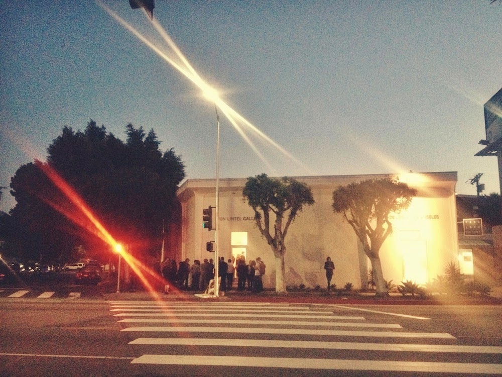
Farrah Karapetian is a renowned Los Angeles based conceptual artist who creates stunning imagery through photograms or “cameraless” photography. She studied as an undergraduate at Yale University and received her MFA at UCLA. She just concluded an exhibition at Danziger Gallery in New York City and looks forward to her second exhibition at Von Lintel Gallery in Los Angeles in January 2016.


When did you first think of becoming an artist?


It’s true. The majority of my practice involves cameraless  photographs – or “photograms” – and the making of sculptural negatives  en route to their exposure. My sculptural negatives are  three-dimensional objects the bodies of which operate according to the  logic of light. I am not at all interested in the cameraless photograph  as such, however; my practice is not driven by anachronism. I am  interested in how images exist in the world, and a lot of my cameraless  work examines existing photographs and reimagines the way that they  circulate. Cameralessness makes that process of reimagining more  physical and present and drawn out for me than do other photographic  processes. In a sense, however, you could say that if I am influenced to  make a cameraless photograph from a photograph I’ve seen circulating  online, that cameraless photograph originates from a photograph taken  with someone’s camera.

Read full interview here

 
You are known for creating “cameraless” art. Does any of the work originate from a camera?


It’s true. The majority of my practice involves cameraless photographs – or “photograms” – and the making of sculptural negatives en route to their exposure. My sculptural negatives are three-dimensional objects the bodies of which operate according to the logic of light. I am not at all interested in the cameraless photograph as such, however; my practice is not driven by anachronism. I am interested in how images exist in the world, and a lot of my cameraless work examines existing photographs and reimagines the way that they circulate. Cameralessness makes that process of reimagining more physical and present and drawn out for me than do other photographic processes. In a sense, however, you could say that if I am influenced to make a cameraless photograph from a photograph I’ve seen circulating online, that cameraless photograph originates from a photograph taken with someone’s camera.

Beyond Muscle Memory: An Interview with Farrah Karapetian | Georgia Review

By On November 4, 2015 · In Interviews 
By On November 4, 2015 · In Interviews
fall15current 
Artist Farrah Karapetian’s oeuvre intensely engages the art of photogramming as she locates emotional weight in the physical making of her often politically rooted subject material. In the case of Muscle Memory, featured in our Fall 2015 issue, Karapetian’s focus, as indicated, is the muscle memory of U.S. Armed Forces veterans and their relationships to their weapons. With clear resin, the artist created three casts each of the veterans’ typical sidearm (P226 Sig Sauer) and rifle (H&K416), produced multiple photograms from those, and then orchestrated the veterans into military postures, where they would remain stock-still with their prop weapons while 1:1 scale images were rendered behind them.
In this interview, Lamar Dodd School of Art Galleries Director Katie Geha—who worked with Karapetian during her recent artist-in-residence stint at the Dodd—engages Karapetian in an in-depth discussion of the physical and philosophical practices that go into making her photograms.

(To view the Muscle Memory portfolio and to read managing editor  

Jenny Gropp’s introduction to the project, head here.)

***** 
Katie Geha: How do you choose the objects that you work with?

Farrah Karapetian: I don’t, or at least if I choose to work with an object, the identity and nature of that object are choices inherited primarily from the people or places that move me.
In the case of the body of work I call Accessory to Protest, the eight objects I worked with were listed on page four of a flyer distributed in Egypt before the protests that ostensibly brought down Hosni Mubarak in 2013. They were described as the accessories one might need in order to perform the act of protest, among them a “sweatshirt or leather jacket with a hood” that “helps shield your face from tear gas” and “spray paint so that if the authorities attack us, we can spray paint the visors of their helmets and the windshields of the armored trucks, blocking their vision and hindering their movement.” I was fascinated with this list and this document in general, which seemed like already a false artifact of the Arab Spring even as protests continued. How can one really instruct a populace in the art of civil disobedience, even with a checklist of accessories?
I remade the document itself as a photogram at life size so that it might be experienced more phenomenologically, text and all. A potent part of that process was remaking the objects—banal, every one of them—as clear sculptures to be used as negatives that would conduct light and therefore translate volume onto the photographic picture plane. Remaking the objects as negatives is a mimetic act and a first step of intentional encounter with the subject. It is also the first photographic act, insofar as the objects are remade according to the logic of light and truth. 


Friday, November 27, 2015

Firework Explosions Captured on Paper — Rosemarie Fiore featured @ The Creators Project


Rosemarie Fiore, Smoke Eclipse #21, 2015, 28x 28 inches


By Noémie Jennifer 


"Painters usually have to work with the element of gravity, with paint dripping down. With me it's the opposite. My materials want to shoot up, and the challenge is to force them down onto the paper," explains Rosemarie Fiore on the phone from Los Angeles, where a show of her paintings opened last weekend at Von Lintel Gallery. The works, which feature circular pools of rich colors, make up a new series entitled Eclipse. Like planets orbiting silently, they cross each other’s paths and seem to vibrate on the paper.
 
Rosemarie Fiore, Smoke Eclipse #21, 2015, 28x 28 inches

Fiore lives and works in the Bronx and has been using found machinery to create artwork since her residency at Skowhegan, completed after her years in graduate school. Her first experiments with fireworks began during a stint in Roswell, New Mexico, with an accident. “I was lighting off a smoke bomb and dropped it, and as it moved it left a blue dotted line,” she says.


Photo by Ross Willows, courtesy of Rosemarie Fiore Studio and ART OMI, Ghent, NY
Since then she has crafted increasingly sophisticated tools to capture color and smoke. “At first I was just duct taping fireworks to a broomstick and dragging it along the paper,” she says. Now her laboratory includes various containers on wheels, with spouts specially designed so the lit smoke bombs hit the paper with the right pressure. The tools are perpetually in development: “While I’m creating the work, I’ll see that I can add a new extension. I’m always editing the tools and developing things.” For the Eclipse series, she modified a trash can lid and named it "Space Oddity."

She describes her process as a meditative dance on top of the paper, carried out in silence—these are smoke bombs, not fireworks with gun powder. “Some machines move better than others. It’s like a dance partner: when you have a good partner, you don’t have to force anything. You can anticipate each other’s movements and move together smoothly.” The dance has strict time limits: once the smoke bombs run out of pigment, the show is over.

The Eclipse works are pared down compared to the larger paintings Fiore previously made with smoke bombs, which used collage to create hectic, layered compositions. “This show is much more about the simplicity of the smoke, about the colors interacting and creating subtle depths.” The use of a smooth printmaking paper also helped to yield those dreamy hues.

Larger pieces in this series are in the works. In coming months, Fiore will be collaborating with the metals department at UNC Greensboro to create a huge “eclipse maker tool” four feet in diameter.

Since then she has crafted increasingly sophisticated tools to capture color and smoke. “At first I was just duct taping fireworks to a broomstick and dragging it along the paper,” she says. Now her laboratory includes various containers on wheels, with spouts specially designed so the lit smoke bombs hit the paper with the right pressure. The tools are perpetually in development: “While I’m creating the work, I’ll see that I can add a new extension. I’m always editing the tools and developing things.” For the Eclipse series, she modified a trash can lid and named it "Space Oddity."

She describes her process as a meditative dance on top of the paper, carried out in silence—these are smoke bombs, not fireworks with gun powder. “Some machines move better than others. It’s like a dance partner: when you have a good partner, you don’t have to force anything. You can anticipate each other’s movements and move together smoothly.” The dance has strict time limits: once the smoke bombs run out of pigment, the show is over.

Rosemarie Fiore, Smoke Eclipse #52, 2015, 28x 28 inches


The Eclipse works are pared down compared to the larger paintings Fiore previously made with smoke bombs, which used collage to create hectic, layered compositions. “This show is much more about the simplicity of the smoke, about the colors interacting and creating subtle depths.” The use of a smooth printmaking paper also helped to yield those dreamy hues.

Larger pieces in this series are in the works. In coming months, Fiore will be collaborating with the metals department at UNC Greensboro to create a huge “eclipse maker tool” four feet in diameter.

Rosemarie Fiore, Smoke Eclipse #42, 2015, 28x 28 inches


 Read full feature @ The Creators Project


Saturday, October 24, 2015

Edward Burtynsky’s Mesmerizing Images of Copper Mines | Feature in The New York Times Magazine


The scale of an open-pit copper mine feels impossible; it is a Bible-grade phenomenon made by machines. Vehicles called bucket-wheel excavators, nearly five times the size of the largest dinosaurs, rip up the surface and gradually descend, piling 200,000 cubic meters or more of rock behind them every day. Once the copper is extracted, waste products and unrecoverable metals stream out as tailings, snaking tributaries that turn psychedelic-looking as they oxidize in open air for the first time in millions of years. Each excavator, meanwhile, turns the land it is standing on into a ledge and leaves a succession of these steps, or ‘‘benches,’’ behind it as it goes. The Chino Mine, for example, in Grant County, N.M., has been excavated persistently for more than a century and now stretches almost two miles across and 1,350 feet down. It’s a chasm, a void, a deep and disordered amphitheater built around an abyss. It gets four out of five stars on TripAdvisor.


‘‘Wow is that place HUGE If you get time go visit this mine it is just huge,’’ writes one reviewer who visited the overlook point on the side of Highway 152. ‘‘What a huge pit,’’ says another. Another: ‘‘Wow!’’ Another: ‘‘What a hole in the ground’’ And: ‘‘Dange [sic] it’s deep. What a hole!@!!!! Huge hole in the ground.’’

Stupefied giddiness, disbelief: these seem to be universal responses to open-pit mines. When the photographer Edward Burtynsky started taking pictures of mining complexes in 1981, it was, in part, out of this same simple wonderment. ‘‘I look for the biggest mines in the world,’’ Burtynsky says, and these photographs, shot in Arizona and New Mexico in 2012 and published here for the first time, include both the Chino and the continent’s largest copper mine, the Morenci Mine, which is projected to produce 900 million pounds of copper every year for the next five years.


Open-pit mines are wounds we’ve inflicted, and the wonderment they excite easily becomes tinged with pangs of remorse or dread. Burtynsky calls that storm of feeling ‘‘a reversal of the sublime. In the beginning, ‘the sublime’ meant us in fear of nature,’’ he explains. We would look up at a thundercloud or mountain, or across a heavy sea, and be ‘‘awe-struck or powerless. But fast forward to the Industrial Revolution, and 150 years after that, and now we are the awesome and fearsome force that’s reshaping the planet.’’


And that power can’t be disowned. ‘‘We work in a world of atoms and molecules,’’ Burtynsky told me. ‘‘I’m talking to you on a phone. There’s copper in this phone.’’ It’s in our appliances and cars, inside the walls of our homes. ‘‘If you feel revulsion to this landscape,’’ he said, ‘‘you should have a revulsion to your whole life.’’ 


That tension is irreconcilable, maybe inevitable. Humans have always ripped materials out of nature, but the pace and scale of that extraction has accelerated so quickly that it challenges, or even outpaces, the individual human imagination’s ability to make sense of the consequences. It’s a strange predicament: to feel dwarfed by the momentum of your own species; to feel yourself being threatened, even swallowed up, by problems and to recognize that you’re also complicit in them. Think of how the person operating the excavator must feel, disappearing down the mine.


Burtynsky’s photographs are opportunities to stare that dilemma in its abysmal eye and let that tension in; to look down — way down in these mines — and allow yourself to feel unsettled, to lose your balance a little.


‘‘Huge hole in the ground,’’ one of the more pensive TripAdvisor reviewers wrote. ‘‘I just imagine falling into that hole.’’ Exactly. There may be no getting to the bottom of any of this.

Read original article @ The New York Times Magazine


KLEA McKENNA | Contact: Direct Reflections of Landscape — Featured Interview @ lensculture


For the past few years, California Bay Area artist Klea McKenna has focused her attention on photograms—an image created directly on a light-sensitive surface, without the aid of a camera. By responding deeply and personally to particular locations, McKenna produces large, immersive works that, though seemingly abstract, retain a direct link to the environment that produced them.

Her work is beautiful yet entirely mysterious. Each photogram (which is unique) seems to hold a silent secret that pulls us in deeper with each passing moment. Managing editor Alexander Strecker had the chance to sit down with McKenna and find out more about her work and the lessons she has learned as an artist.

LC: Walk us through constructing one of your photograms, say your "Rain Study" series. You take a piece of photo-paper, you bring it outside and...?

KM: For my "Rain Studies," I work at night, outdoors, in the pitch darkness. I need to work far away from civilization and on nights where there is no (or very little) moonlight. Lately I've been making Rain Studies in Hawaii and I try to schedule my stays to coincide with the dark of the moon or to work at night when the moon hasn’t risen yet or has already set. And of course, it has to be raining!

While I work, I have a covered area that I can keep my supplies under, a garage, barn or when I'm in Hawaii I work out of a shipping container in the forest. I run in and out of the rain and my work station and make exposures using flashlights.

The things that affect the finished image: every storm is different and there are different-sized raindrops and different patterns that the drops make. The part I can control that affects the image are the angles: there's the angle of the light to the paper, the angle of the light to the rain, the angle of the rain to the paper. After all, if you think about photography—the film and the camera, enlarging in the darkroom—the relationship between the substrate and the light is almost always perpendicular. If you change that, a whole world of possibilities opens up.

When I'm in Hawaii (or really anywhere working on location) I work completely blind for a few weeks. It's like the entire outdoors become my darkroom—but since I don’t actually have a wet darkroom out there, I can't develop anything. Two weeks is usually the psychological limit to how long I can work without seeing any results. After that, I start to doubt myself and ask, "Maybe this is all just gonna be black...what am I even doing?" 

LC: What inspires you to pick the locations that you choose?

KM: The landscapes I choose are places that hold some personal significance for me or mark a collective history that I find interesting. Although I'm very thoughtful about where I go, in the end, my aim is to make my materials interact directly with the place, to figure out ways to make the landscape imprint on my materials. I'm trying to orchestrate an interaction—but mostly I'm trying to get out of the way.

A few years ago, I went back to Hawaii where I had spent much of my early childhood. Since my dad had died a decade earlier, I hadn't been back much. But I decided to return to our family house—way up in the middle of nowhere, off-the-grid and adjoining a forest preserve—and just bring all of my light-sensitive materials.

The way I work is rooted in a deep observation of the landscape and of nature. And each work comes out of direct contact with its surrounding environment. In that way, it's totally photographic: there's a direct reference to reality. Even if the work appears abstract at first glance, it's actually hyperrealistic in some cases.

Read full interview @ lensculture

Friday, October 16, 2015

MICHAEL WAUGH: BOOM AT VON LINTEL GALLERY — Daily Serving Feature


Michael Waugh. Les Règles de l’Art, 2015
ink on Mylar; four panels, 102 x 42 in. each

Written by Calder Yates

Michael Waugh's first solo exhibition in Los Angeles, Boom, is currently on view at Von Lintel Gallery. Using ink on Mylar, Waugh reimagines an assortment of 19th-century tableaux, depicting quaint scenes of countryside estates and horse stables, as well as turn-of-the-century buildings on New York City streets. These representational drawings consist wholly of handwritten text: Scribbled sentences produce the contour lines of buildings as they crumble to the ground, while epistolary markings provide contrast to form the underside of a horse. Letters and numbers further constitute the hands and faces of male figures. Waugh has painstakingly scrawled and layered words and sentences across the sheets of Mylar to construct the entirety of every image, spending three to four thousand hours to produce each piece. The amount of labor alone puts Waugh’s drawings on par with the historical legacies of endurance works.

The incongruous titles of the drawings, such as Unfettered Markets (FCIR, part 4) (2015), hint at the content of the words and sentences used to create them. Waugh uses the Congressional Financial Crisis Inquiry Report to form the images of stately manors and equestrians. In Derivative (FCIR, part 5) (2015), the phrase “too big to fail” delineates the horse’s genitals. For the largest piece in the show—a four-panel work depicting a crowd watching a building collapse—Waugh plums Les Règles de l'Art (The Rules of Art) written by the philosopher Pierre Bourdieu. Like a gunshot, the stupendous amount of time and labor put into Les Règles de l’Art (2015) is immediate and breathtakingly obvious. 

Michael Waugh. Derivative (FCIR, part 5), 2015 (detail)
ink on Mylar; 42 x 65 in

None of Waugh’s drawings contain a single image of a woman. Waugh depicts men circulating among more men through fictional thoroughfares or rowing along on a polite, tree-lined river. Even inside the stables, only studs are found. Waugh evokes an old world based on good manners, pedigree, and male dominance. In the far right panel of Les Règles, a couple of men grope each other. Pleasure, here, flows only between men.

By combining three basic elements—images of 19th-century “good taste,” words describing 21st-century financial catastrophe, and dominant masculinity—Waugh implies that our current economic boom-and-bust cycles are rooted in a history of gendered aesthetic calculus. In other words, the “good life”200 years ago—a life that included property, leisure, and commodities, and that excluded any instances of women or people of color—continues to inform our present-day, exploitative, unequal economic system. Waugh’s drawings are a veiled swipe at an earlier era’s role in the construction of our inherited conditions of hierarchy.
Michael Waugh. Before Our Very Eyes (FCIR, part 2), 2015 (detail)
ink on Mylar; 25 x 25 in.
As a result of their illustrative qualities, Waugh’s drawings serve primarily as a demonstration of his argument, acting as a simple equation toward his artistic logic. The works indicate a cognitive tension, all the while allowing viewers to walk away with no visceral uneasiness—mostly due to the drawings' benign imagery. The only tension in the works lies exclusively within Waugh’s implied argument that 19th-century male-dominated society may be ipso facto the very problem we have today. The drawings hint at—rather than declare—this argument, which is an unsurprising one that has already been well-articulated over the past half-century.

Other artists have created this cognitive tension while also exploring material and visual tension. Glenn Ligon's text-based paintings, for example, contain similar, damning references to hierarchies of class, race, and power. Ligon's works, however, also contain an exploration of materials: coal dust mixed with acrylic, silkscreens on unstretched canvasses, neon lettering, and powder-coated aluminum. Waugh seems to ask viewers to look past his use of materials (ink on Mylar) to consider only his imagery, while Ligon's use of materials deliberately confuses image and ground, never taking the white surface for granted.
Michael Waugh. Derivative (FCIR, part 5), 2015
ink on Mylar; 42 x 65 in.
Waugh's drawings and the tidiness of his argument suffer from the very processes he hopes to critique. Beyond the horse scrotum cheekily formed from the words “too big to fail,” there is little surprise or confusion in his work; the drawings are fun and easy to look at. Where is the moment when the viewers of the work are implicated in the drawings' depictions of hierarchy of class and power? This is the irony of easily digestible (and purchasable) critiques of hegemony. Like a flu shot, the hegemonic system has taken in and processed its critique, and becomes stronger and more entrenched as a result. When does looking at these drawings move beyond a gentle and agreeable experience, and into an uncomfortable one, in which one cannot—ought not—look away?

Read original article @ Daily Serving


Thursday, October 1, 2015

CONTINUED AND RECOMMENDED, OCTOBER 2015 | ARTSCENE Feature

Michael Waugh, “Les régles de l’art,”
2015, ink on mylar, 4 panels, each 102 x 42"
Michael Waugh's obsessively intricate drawings on mylar have a noble and ever-poignant central core — the troubling intersections of politics, wealth and power. Using micrography, transforming written text into representational imagery, he presents scenes both urban and semi-rural, as well as detailed portraits of horses, in a graphic aesthetic consistent with their late 19th/early 20th-century settings. Using texts from capitalist theory among other similar sources, Waugh's newsprint-like imagery is so finely rendered that it only breaks down into text under careful inspection. These are not mere formal exercises. The horses and human figures alike are depicted with an innocent charm that belie the ominous forebodings made apparent in titles such as "Crisis on the Horizon," or the spot-on word-to-text interplay of "Before Our Very Eyes." "Les règles de l’art," at 102 x 168 inches on four panels, is by far the largest piece, and also the most spectacular: a city street of perhaps a century ago stretches from a corner off towards a distant bend. The fourth building down from the corner is in mid-implosion, as if detonated from within, but only the horse-and-carriage faltering just beneath its collapse appears to register the dire circumstance; others just mill about. The work is too stylized to suit the literal content of Pierre Bourdieu’s book Les règles de l’art, (“The Rules of Art”) which explores the connection between art and the social structures within society by which art is produced and received. But Waugh's message and method execute a perfect tip-toe of a sneak attack. 

Also on view are selections of Izima Kaoru’s large-scale, highly saturated color photographs from the series "Landscape with A Corpse." The photographer depicts moments of death as imagined by his super-star models. In each staging the model is dressed in high fashion, albeit sometimes covered in blood. The magnificence and power of the industrial and natural landscape depicted in the photographs, in many cases, dwarfs the figure whose dramatically staged death is thus insignificant in relationship to the architecture (Von Lintel Gallery, Culver City).

Michael Shaw / Jody Zellen 

Read more @ ARTSCENE


Friday, September 11, 2015

MICHAEL WAUGH | BOOM - Sept 12 — Oct 31, 2015


Von Lintel Gallery is pleased to present Boom—an exhibition of new work by artist, Michael Waugh. The exhibition marks the artist’s first solo show with the gallery and in the city of Los Angeles.

Waugh’s ink drawings on mylar utilize imagery constructed entirely out of handwritten text. Hundreds of pages from government reports and theoretical writings about power and capitalism are transcribed word for word into airy, visual compositions that reinterpret 19th century tableaux: stately portraits of horses, cowboys on the homestead, a team of rowers racing down the river.

The white space and sense of lightness in these drawings belie a frenetic surface teeming with cramped, labored handwriting only visible upon close inspection. Occasionally, the tight scrawls unfold into a more generous script. Discernible words and phrases like “CITIBANK” and “clearly illegal” surrender a subtle awareness of the works' larger context, raising questions about the difficult to digest text, in this case—The Congressional Financial Crisis Inquiry Report. The bureaucratic haze of the document is amplified and mirrored in the tension between image and word.

Included in the exhibition is the largest piece the artist has constructed to date: a four panel work measuring fourteen-feet in length. The text is a complete transcription of Pierre Bourdieu's Les régles de l’art—or, The Rules of Art—exploring the interconnection between art and the societal structures within which it is produced and received. Inked by Waugh in the original French, Bourdieu's sociological musings on cultural capital are woven into a street scene of an exploding building, threatening a crowd too distracted to notice.

Michael Waugh was born in Cambridge, MA. He earned his graduate degree in painting from New York University in 2000; but he also has degrees in writing from Texas State University and history from the University of Texas. He has exhibited internationally for the last fifteen years and his work has been reviewed by the New York Times, Art in America and ARTNews. He is the recipient of awards from the New York Foundation for the Arts, The Marie Walsh Sharp Space Program and the Pollock-Krasner Foundation.

The artist lives and works in Brooklyn, NY.

Saturday, August 29, 2015

Floris Neusüss and Perfect Likeness | KCRW Art Talk Feature


The photogram, using an enlarger and photosensitive paper to make an image without the use of a camera, was a staple of experimental photography in the early 20th century and used to great effect by Man Ray or Lázsló Moholy-Nagy. Such analog techniques have been embraced recently by a number of contemporary photographers. Thus, it is ideal timing for a small show of work by the German artist Floris Neususs, who has done extraordinary things for 50 years with the photogram technique. Dreams + Photograms at Von Lintel Gallery closes August 15.

Most well-known are his nudograms from the 1960's and 70's — Korperbilder — that track the human figure, especially women, as ghostly presences, both dark and light, detailed and unclear, yet life size on huge sheets of paper.

at150813HeineckenNeimanas-VonLintelGallery.jpg
Floris Neusüss, "Portrait of Robert Heinecken; Portrait of Joyce Neimanas," 1997
Gelatin silver photograms on auto-reversal paper; 90.6 x 41.7 inches (230 x 106 cm), each
Courtesy of Von Lintel Gallery

This show includes the 1997 life size photograms of his close friend and collaborator Robert Heinecken and his wife, photographer Joyce Neimanas. Their dark silhouettes on creamy backgrounds are instantly recognizable to anyone who knew them. And, they are only sold as a pair, so they can remain a couple.

at150813Nachtbild-VonLintelGallery.jpg
Floris Neusüss, "Nachtbild (48), 1991
Gelatin silver photogram; 68 x 42 inches (175 x 106 cm)
Courtesy of Von Lintel Gallery

Neususs also made photograms of landscape by placing the paper with the emulsion side down and exposing it to lightning. Grasses, leaves, twigs appear in a beautiful chaos of silvery blacks and grays. Even Neususs student work from the 1950's, before he embarked on photograms, shows a propensity to experimentation.


Read more @ KCRW


Wednesday, July 22, 2015

Floris Neususs — LA Times Review by Christopher Knight


Before there were photographs made with cameras, there were photograms – or, to use Henry Fox Talbot's 1834 term, “photogenic drawings.” Put an object on light-sensitive paper, add strong illumination and a shadowy picturee appears – without mediating machinery.
At Von Lintel Gallery, a selection of seven photograms (plus seven conventional photographs made with multiple negatives) by German artist Floris Neusüss show how camera-less images have periodically been re-embraced. Neusüss’ photograms, dating as early as 1971 and as recently as 1997, are silhouettes of life-size figures.

Two mostly documentary works, their contours suggestive of paper-cutouts, show L.A. artists Joyce Neimanas and Robert Heinecken, who also made photo-based works without benefit of a camera. Another sets a profile figure against a building whose windows offer a glimpse of a photographer’s studio within. That the figure recalls the stiff formality of an ancient Egyptian wall painting yields an aura at once rudimentary and reverently antique.

Three abstracted female nudes feature flame-like bodies, since the figures only partially touched the light-sensitive paper during exposure. Light seeped around and beneath their torsos and limbs, and the bodies may have moved.

The fluid results are distinctive. Pinned to the wall and hanging loose, like scrolls, they exist somewhere between traditional Japanese ink paintings and the 1960s “anthropometries” of Yves Klein.

Klein’s models pressed their paint-smeared bodies against large sheets of paper to make latter-day versions of Matisse’s landmark “Blue Nude” painting and collages. In a photogram, the conventional photographic distance between subject and image is likewise collapsed.

Neusüss’ photograms are less technical innovations than they are cross-disciplinary meditations on aesthetic fundamentals, regardless of time or place. Their perhaps surprising sense of intimacy comes from the simple knowledge that human bodies actually touched the paper that we’re looking at.

Neusüss spells it out in the final work, in which a young man hanging a black rectangle on a wall stands on the silhouette of a chair to reach the top, while the actual chair abuts the photogram. A whimsical image of ephemeral existence, it’s like a picture of Peter Pan trying to get his purloined shadow back.

LA Times


Thursday, July 2, 2015

FLORIS NEUSÜSS | DREAMS + PHOTOGRAMS, June 27 — Aug 15, 2015


Von Lintel Gallery is pleased to present work from acclaimed German photogram artist, Floris Neusüss. A pioneer of experimental photography since 1958, Neusüss has devoted his entire career to the rigorous study, practice and teaching of the photogram technique.

Analog methods are experiencing a wave of resurgence as contemporary artists mine history to investigate the possibilities of photographic materials. Neusüss is recognized as part of the photogram vanguard along with predecessors Man Ray and Lázló Maholy-Nagy. His work has been included in major experimental photography exhibitions at the Victoria & Albert Museum, London; the Sprengel Museum, Hannover, Germany; the Museum of Fine Arts Houston; and the International Center of Photography, New York among others.

The Von Lintel Gallery exhibition features the artist’s iconic nudograms—Körperbilder—from the 1960s and 70s that were made by exposing the human figure directly onto photographic paper. The proximity of the model to the paper influenced the sharpness of the contours and the amount of light dispensed affected the intensity of the tones. Movement—either accidental or intentional—dissolved and fractured the silhouettes into transcendent forms removed from any sense of time or place. Despite the subject’s absence, a palpable intimacy—or, presence—is felt. Such is the magic of a photogram.

A similar phenomena transpired when Neusüss applied the photogram to portraiture. He and Robert Heinecken were friends and collaborators. The Getty Museum owns Dinner for Heinecken—a Neusüss photogram exposed during a dinner that used light-sensitive paper in lieu of a table cloth. During another work session, Floris exposed Heinecken’s full body on profile. The work—included in the show—does not reveal any surface details and yet the expressive body language and attitude of the subject is uncannily recognizable. As Neusüss says, “If you knew Robert Heinecken, when you look at his portrait photogram, you automatically feel close to him.” 

Also on view are early gelatin silver prints from late 1950s made while still a student in Munich; an innovative piece from the 1980s that merged a photogram with sculpture; and Nachtbilder, a series produced by placing photo paper emulsion side down into a woodland or garden at night. At times created during a thunderstorm, lightning would expose the paper from all directions, catching gusts of impressions from below and above. A sense of movement and chaos transformed the familiar into something much more arresting; an aesthetic echoed throughout Neusüss’ career.

Floris Neusüss was born in 1937 in Remscheid Lennep, Germany. He has exhibited internationally for over fifty years and his work is included in numerous public collections including the Museum of Modern Art, New York; the J. Paul Getty Museum, Los Angeles; the Victoria and Albert Museum, London; the Art Institute of Chicago; and the Museum of Fine Arts, Houston. His work has been published in several monographs and he was the subject of an expansive illustrated volume produced in conjunction with the 2010-11 Victoria and Albert exhibition on the work of five camera-less photographers. He was an influential teacher in Germany and recently retired as Professor in Experimental Photography at the University of Kassel, a post he had held since 1971.
Neusüss lives and works in Kassel, Germany with his partner Renate Heyne.


ANTONIO MURADO | DISTANCES, June 27 — Aug 15, 2015

 
Von Lintel Gallery is pleased to present new paintings by New York artist, Antonio Murado. Distances marks the artist’s fifth solo show with the gallery and his first solo exhibition in Los Angeles.

Murado is a technical virtuoso who returns to familiar motifs to continue experimenting with the capacity of paint to express the realities of nature. Whereas many artists lament the mind’s habitual reflex to interpret a horizontal piece as a landscape, Murado embraces it. His work hinges upon illusion as he conjures forms without actually rendering them. From a distance, latitudinal swipes of rusted orange or chartreuse green anchor apparent twinkling cityscapes or mountain ranges. But in actuality, the works are deft striations of pigment impressed with textural patterns.

Similarly, material investigation and process reinvigorate traditional conceits of still life. Canvases are treated with delicate, transparent layers of oil and turpentine that underwrite pools of paint, blown with air. The shapes may mimic flower petals floating in mid-air or across a flow of water, but it is gesture that reigns here over figuration.

“The results of these experiments in alchemical materiality is a variegated series of paintings that, with infinite nuance, convey Murado’s own plastic versions of the different domains of the life of nature.” —Alexandre Melo, ArtForum.

Murado was born in Lugo, Spain in 1964 and graduated from the University of Salamanca. Shown internationally in multiple solo and group exhibitions around the world, Murado’s paintings are now held in prominent museum, corporate, and private collections including The Galician Center of Contemporary Art, Santiago de Compostela, Spain; The Museum of Fine Art, Vitoria, Spain; The Nagasaki Art Museum, Japan; and in the collections of Phillip Morris, American Express, Chase Manhattan Bank, AXA, Pfizer, and The Coca-Cola Corporation.


Saturday, May 16, 2015


By David Pagel

May 15, 2015

If ants had cameras—as well as helicopters, drones and hydraulic lifts—they might make photographs that look a lot like Edward Burtynsky’s sublime pictures of the marks humans have made on our planet.

These include massive dams, mines, wells and farms, alongside quarries, irrigation systems and flood control plains. At Von Lintel Gallery, the Canadian photographer, who has traveled the globe to make his stunning images, invites visitors to see humanity as a species—not as unique individuals who stand out from the crowd, but as indistinguishable, and very small, components of a much larger whole—like ants in a colony.

That’s a fascinating perspective, partly because it flies in the face of the way we usually look at art—as an embodiment of the singular genius of singular geniuses—and partly because it gets us to look at the big picture: our global economy in which some fundamental resources—like water, air and food—may not be able to sustain the rate at which humans have been reproducing. What that means for life as we know it is the subject of Burtynsky’s panoramic landscapes.

Beauty and ugliness, nature and industry, exist cheek-by-jowl in his crystal-clear pictures. Some are hellish, their glistening lakes of radioactive oil bleeding from the Earth like a toxic wound that won’t heal. Others are gorgeous, their snow-capped peaks and steep ravines so breathtakingly vast that they make human beings seem inconsequential.

Most are both. A drone’s-eye view of a dam under construction on the Yangtze River presents an entirely manmade landscape that looks utterly alien, like a concrete spaceship so far out in the galaxy that it’s impossible to tell up from down, left from right, right from wrong. Shot from helicopters, two views of terraced mountainsides, where Chinese farmers grow rice, show what daily labor adds up to when it’s done over centuries.

Above all else, Burtynsky’s pictures are humbling. Sober and sensible, they make it clear just how little individuals can do on our own while suggesting that as a group we have a lot to learn from ants.

Read more @ LA TIMES

Friday, May 8, 2015

Edward Burtinynsky's "Nature Transformed" @ Von Lintel Gallery, Los Angeles | Juxtapoz Magazine Feature


Von Lintel Gallery is pleased to present an exhibition of large-format color photographs by renowned photographer, Edward Burtynsky. the photographer is known for his incisive look at landscapes reshaped by human interference. Nature Transformed primarily culls from Water, a five-year project chronicling the dramatic effects of manufacturing and consumption on the world’s most vital and rapidly depleting resource. Science fiction-esque irrigation plots in Texas, ancient carved stepwells in India, and geometric rice terraces in China are translated in vivid color and crystalline detail from upwards of 7,000 feet. The aerial perspective necessarily brings into focus the massive scale and impact of these systems employed to redirect and control water. “I document landscapes that, whether you think of them as beautiful or monstrous, or as some strange combination of the two, are clearly not vistas of an inexhaustible, sustainable world,” Burtynsky states. “We have to think more long-term about the consequences of what we are doing, while we are doing it. My hope is that these pictures will stimulate a process of thinking about something essential to our survival, something we often take for granted—until it’s gone.”

Also on view are images depicting the pitch black Volcanic sands of Iceland, marking Burtynsky’s return to pristine wilderness for the first time in over thirty years, and photographs from the Oil series: rectilinear rigs in Asia and tar sands operations in Alberta, Canada

Exhibtion runs: April 25 -June 20, 2015

Read original article @ Juxtapoz Magazine
 

Perspective Paris Photo Los Angeles 2015 | Klea McKenna Featured in Collector Daily


Editor’s Note: The Paris Photo Los Angeles fair held last weekend was one we unfortunately couldn’t attend in person, but we asked Carol Lee Brosseau to gather up her image highlights as a proxy for actually walking the halls ourselves. Carol Lee is an LA-based art advisor, appraiser, and former gallery director at Joseph Bellows Gallery (her site is here). We’ve known Carol Lee for the better part of a decade, and she has always had an uncanny ability to understand our eclectic eye for work. While she has been able to highlight images that fit into our personal collection with surprising consistency over the years, the choices and comments below are her own. -LK

By Carol Lee Brosseau / In Art Fairs / May 5, 2015
 

Paris Photo! In Los Angeles! On a New York back lot!

To me, Paris Photo LA at Paramount Pictures Studios is one of the most fun art fairs to attend. The relaxed and entertainment-driven atmosphere is a welcome antidote to the often hectic grind of other art fairs. While the majority of galleries are set up in booths on the larger sound stages, several galleries and the book dealers are set up in the “brownstones,” “shops,” and “cafés” of the New York City street back lot. The result is essentially a faux city where guests can go door-to-door, just like gallery hopping in Chelsea. It’s like The Truman Show…with photographs.

Visitors snack on tacos from food trucks and sip wine or beer on any one of the “New York City stoops,” chatting, people watching, and celeb spotting. The outdoor spaces and sunny LA weather make the fair quite a pleasant place to be.

This year there are 80 galleries and book dealers from 17 countries. The inclusion of so many international galleries is nice as they offer fresh work not often seen in LA. The fair is heavy on contemporary photography. There are some vintage photographs and older work sprinkled around, but the vast majority of the work is medium to larger-scale contemporary.

Missing from the fair are a lot big names in photography, referring to both dealers and photographers. (Galleries such as Gagosian and Fraenkel, who have participated in past years, were absent this year. And it’s been a while since I’ve been to a photo fair with out seeing an Eggleston.) I couldn’t help but think it would be nice to have more classic photography and more of the staple photo dealers there to give context and to balance out much of the newer work and younger galleries. But I suppose when you’re standing in a temporary plywood room just inside a brownstone façade on an artificial New York street in Los Angeles, the need for context has already been eliminated. And it is in fact refreshing to see so many new galleries and new work represented.

All in all, Paris Photo LA is a great way to spend an afternoon or a weekend and see lots of art. Here are some of the highlights for me.

Read original article @ Collector Daily