VON LINTEL GALLERY

Showing posts with label INTERVIEWS. Show all posts

Monday, February 9, 2015

FARRAH KARAPETIAN | Mapanare: 'Farrah Karapetian's Photograms @ Miami Project 2014, The Artist Talks Extensively On Her Work

PictureHomophony II
Farrah Karapetian, whose work was shown at Miami Project by Von Lintel Gallery (Los Angeles) during Miami’s Art Week, is a creator of photograms, camera-less photographs. She took time to answer some questions about her work in general and Miami’s Art week.

The artist lives in Los Angeles and has recently had work shown at the Torrance Art Museum, the Armory Center for the Arts in Pasadena, the UCR/California Museum of Photography, the Vincent Price Museum and the Orange County Museum of Art.

In addition to her work being shown in Miami, she has an upcoming solo exhibition at Von Lintel. Find out and see more HERE.  


Picture
Slur

Your work seems to be both high concept and require extensive detailed attention regarding technique as well. To you, as the artist, what is most important--the concept or the visual, the aesthetic? I ask because, looking at the pieces (out of context) they seem beautiful with no explanation.

Thank you. I think, as in all introductions, human or otherwise, when we meet an artwork, we can find it beautiful and leave it at that, or we can find that we want more from it. Then we look longer and find out more about it... We ask questions about the elements that appear most mysterious and about which we are impatient to know more, but for the most part, all the clues are in the work.

There is no separation between the concept and the aesthetic in a good artwork: they create one another. The idea one has informs the way a piece is made, which informs the way it looks, and the strongest work surprises even the artist insofar as the results are not exclusively what one has planned.

My techniques are very simple. They shift depending upon the subject and depending upon what I've learned from observing a piece or body of work I've completed in the past, but all of those shifts are visible in the work: if you look long enough, you'll see where the paper has been touched, where glass might have refracted light, where two shadows suggest different moments of time captured in the image, where the fiction of a reenactment reveals itself.

What's important to me is that the right person develop a relationship with the piece - not at all only in terms of then buying the piece, but in terms of a student imagining themselves into the process and thinking about how it affects his or her notion of photography, a novelist catching the metaphor or grammar of an artwork and thinking about his or her own process, or anyone registering any kind of analogy with the work. It doesn't matter what part of my work burrows into the mind of an observer, as long as it does, and then opens for him or her new lines of questioning. One wants to be part of the conversation in other people's heads.

For the non photographer, non-artists, can you describe the process you use to create your pieces?

My work tends to consist of photograms and related sculptures. To make a photogram, one puts a subject in between a light source and a piece of photo-sensitive paper, then exposes the paper with the light and processes the paper in chemistry, resulting in a photographic print of the shadow of the subject.

So, if you walked into my darkroom to be the subject of a print, I would ask you to stand near the wall; I would point my photographic enlarger at you; I would turn off the overhead lights and turn on the enlarger; and we would look at your shadow together. If you and I had discussed at some point an object or an item of clothing necessary to the memory we were about to reenact, I would have remade it in a transparent material and I would have given it to you now to hold or handle. We would talk about the scene you were here to reenact for me, and I would ask you to use your muscle memory to be able to access the appropriate posture to create the shadow we both respond most to once I begin to expose the print. Then, I would turn off the lights and we would be in complete darkness. I would spend about 15 minutes cutting paper and another 15 getting it up on the wall - all in the dark. Then I would make my way back to my enlarger, you would resume the posture we had discussed, and I would begin the exposure, which is generally under 15 seconds. The room would go dark again; I would roll up my paper and put it in a tube; I would go process this paper in chemistry; and I would return to you so that you and I could discuss the palette of the resulting photogram.

Of course this process changes depending upon circumstance and the process behind making the sculptures and other kinds of photograms is fairly diverse, but that's a description of what has typically gone on in a shoot involving a subject with a memory that interested me.


Picture
In Time
How does inspiration usually strike you in your work? You used past events, memories but what, to you makes a specific event or memory significant enough to create something out of it?

Much of the work of art is in paying close observation to oneself, what one has just done, what comes up next, and how it relates to something that has come before. In short, one has to be hyper-attentive to the threads of one's experience and observations; at the same time as one lives fully, one must reflect on one's life fully. It's a habit I'm sure shared across all professions wherein one must process the past, present, and future at once, but certainly shared across the disciplines of art and writing.

This makes me think of George Orwell's essay, "Why I Write," wherein he describes his habit of narrating his existence: "For minutes at a time this kind of thing would be running through my head: ‘He pushed the door open and entered the room. A yellow beam of sunlight, filtering through the muslin curtains, slanted on to the table, where a match-box, half-open, lay beside the inkpot. With his right hand in his pocket he moved across to the window. Down in the street a tortoiseshell cat was chasing a dead leaf’, etc. etc." In other words, he sees himself in the abstract as he participates in his life, and this became the stuff of later writing.

I mention all this because I think the word "inspiration" can be misleading. It implies that something inspiring happens in isolation, whereas in fact I think an experience or observation or a chance event feels inspiring because the way it connects to my life and/or work is surprising and feels true. If that feeling lasts for any length of time, I will pursue it, and begin to work with it until indeed it has resulted in something else surprising and true. If that doesn't happen, I put it away. Sometimes it rears its head again years later, as a part of a thread whose time has come.

What do you hope people take away from your work (aside, obviously, from purchasing it!)?

A physical registry of experience; a sense of surprise; a lasting image; a new question; a new desire.

You have a BA and an MFA; what was your BA in? I am curious how you moved from a BA (as opposed to BFA) to an MFA.

Well, at Yale, where I got my BA, the art major is a BA rather than a BFA. So, yes, I majored in fine art and concentrated in photography as an undergrad, but the art major is integrated there into the liberal arts curriculum. I actually think this is a great model, because after undergrad art is always integrated into the larger world and its variety of perspectives. Sometimes micro-cultures like the art world can become too insular. I took six years between my BA and MFA, though, during which time I really tested my practice and developed it to a point at which I needed grad school: I had questions that needed to be played out in an interdisciplinary arena unlike the more medium-specific context of undergrad, and UCLA's grad program was the right fit for that.

Have you shown work in Miami before? What do you feel showing does for you as an artist? How do you think this ever expanding week of art help (or not help...) artists? What is good and bad about the week overall?

No, I haven't shown in Miami before, nor been there, and I'm excited to visit Miami as well as exhibit with Von Lintel Gallery there this year. I want to see how the coastline differs from others I've known. Art fairs can be overwhelming for me, visually and experientially; there are so many dynamics between artworks and so many dynamics between people. When I go to a fair - or in this case, 20 fairs, numerous museums, and the NY Times Luxury Conference - I always need to rent an apartment so as to start the day quietly and alone. There's no need to see everything, anyway; the upside of that much art in one place at one time is that it is an opportunity to see work one might not see otherwise, in person rather than as a jpeg. (Jpegs lie.) I want to be surprised by what I see and learn from it. That's what seeing, making, and exhibiting artwork is 100% about. 


Read original post @ Mapanare

Monday, June 9, 2014

FARRAH KARAPETIAN | Begone and present. In the solid-state-nowness. — Feat. interview TAR Magazine


FARRAH KARAPETIAN


Interview by Luca Lisci

Farrah's chromes are object of immanence. 
The world is your metaphor, 
and you are totally caught up in it.


Your ‘visuals' are so present but yet so ethereal… really fascinating... In some of your most iconic works, objects are really put in a documentary  mood. Can we talk of ‘scientific’?


FK  People have used the word "forensics" with respect to my work: the objects imply their association with an event larger than themselves, even if their identities are very banal. One might try to piece together a narrative - fictional, documentary, personal, or scientific - to associate with any one of them, but that narrative is as much linked to personal association as it is to larger events of cultural significance. One writer called the work more of a metaphor than a record, and I appreciated that, because I don't think in a literal way.

Certainly, when I invite people into the darkroom to reenact a memory in front of a piece of photosensitive paper, they are "performing", and each resulting image is an artifact of their performance more than it is an artifact of the original event that they remember. I consider even photograms that result from my own solo experimentation to be artifacts of performance. When I go into the darkroom with a certain set of objects - which I call "negatives" - and a certain set of formal parameters - such as the dimensions of a piece of paper or a particular color palette I'd like to achieve - I then have to be flexible to the improvisational nature of color printing. Color printing is done entirely in the dark and so one uses one's hands a lot to feel physically what one is drawing out with one's tools. What happens next can't be taken back...

I suppose this is the nature of all photographic work: something happens in front of a lens and is surprising, hopefully. One wouldn't call documentary work performative, though, because it doesn't rely on enactment, reenactment, or the intentional staging of circumstances that will lead to happenstance.


L  Many of your titles are grouped into dominant threads.. Veterans, Protest, Surveillance, Public, Ruins, Street.. Have  those threads something in common?


FK These threads are themes I have pulled out after the fact of fabrication for purposes of organization. In truth, each body of work emerges from a personal encounter in the experience of which I can imagine a formal and emotional challenge.

As examples of the circumstances of such an encounter: the work I made with veterans emerged from the muscle memory of a veteran of the US Special Forces and the work around protest emerged from my encounter with a pamphlet distributed before the fall of Mubarak, which was given me by my boyfriend's daughter's mother. The work with surveillance emerged from having been told that my photograms looked like X-Rays and then realizing that I could indeed prefabricate what I was seeing online in terms of X-Rays on the scale of the international border. Some of the work has emerged in response to the particular architecture or significance of a space in which I was given to exhibit. So they are all just challenges I choose to meet.


Read full interview @ TAR Magazine


Friday, January 17, 2014

CANAN TOLON | Interview @ Blouin ArtInfo


Vertigo, Balance and Belonging: An Interview with Canan Tolon

By Ashitha Nagesh

Canan Tolon was born in Istanbul and spent her childhood in France. She spent her formative years between the ages of 1 and 11 in hospital being treated for Polio. Tolon later studied in Scotland, Germany, England and the US, worked in architectural practices for ten years, and now lives and works as an artist in Emeryville, California. However, Tolon disavows readings of her own biography in her body of work - instead, her pieces are made with the intention of allowing the viewer to see themselves within the abstractions. Her work has made use of organic materials, including grass that was grown on canvas and died during the course of the exhibition, rust, and coffee. A series of ink drawings on mylar plastic called Futur Imparfait, completed between 1986 and 1999, have recently been acquired by the British Museum. She spoke to Ashitha Nagesh on the occasion of her first UK solo show, “Sidesteps” at Parasol Unit in London.

I’m interested in your architectural background, because it translates quite strongly into a lot of your work and there’s an exploration of space in a lot of the pieces. Could you tell me a bit more about this?

You know, I think I studied architecture because I was interested in space, rather than the other way around. I worked for ten years in architectural offices, and I realised that although I didn’t have my own office or anything I had a strong idea of space – space and distance have always been very important to me. When I walk I of course take longer than other people, and sometimes I have to work on the floor; so I see a different perspective to others. Of course, architecture really helps as an education in so many ways, for example with scale and draughtsmanship, but I’m really beginning to see that it’s not the architecture that influenced the work – I studied architecture because I wanted to structure my concept of what space was. Even when I made figurative works, space was very much a part of it.

With those figurative works depicting people within the boxes, there’s the idea of inhabiting a space. This might seem like a strange connection to make, but in one of your later monumental works also it looks as though you’ve used pre-natal sonograms?

Yes, I didn’t use sonograms but I used a squeegee and I twisted it to get that same sweeping effect, and the mylar [plastic] gives it that x-ray quality – and the inside of our bodies are spaces also. I was thinking about how we can grow in spaces, in rooms rather than wombs – but the interesting thing is that if you are a woman you might think it’s a pregnancy or similar inhabited space. I like the idea of people reading my works in different ways, especially when doctors look at them and they think it’s about looking under the skin. This is a space that we don’t really know, but we just are. It’s another form of architecture really.

The womb is the first space we inhabit…

Yes! Exactly. It wasn’t intentionally from a womb image, though, it was totally accidental. I never want to use borrowed images; I create my own images, but I want them to look like they’ve been borrowed.

That reminds me of what you were saying earlier in the gallery about wanting to “trick the viewer.”

It’s like a guessing game – and I’m glad that you’re guessing in the game. I basically want people to see something different each time they look at the pieces. I’d be very happy if people were not able to describe my work.

I’m also drawn to your use of grass and other natural materials that decay, marking the passing of time through the course of the exhibition.

In this work [Under Pressure, 1994, in the exhibition catalogue] you can see that there is a repetition. It’s a Cartesian mapping – but when the different elements of the sculpture were placed next to each other, they looked like stretchers carrying bodies. At the same time, they had a beautiful California landscape look, because the California landscape is pretty bold. But because of the rhythm they were also like hospital beds, with bodies lying down to recover.

The idea of the body seems to pervade all of your work.

Yes, exactly.

Read full interview @ Blouin ArtInfo

Wednesday, July 10, 2013

Studio visit with Antonio Murado — Mana Fine Arts


By Amanda Fernandez
Photos by Adam Cohen

Antonio Murado works out of Mana Contemporary’s fifth floor studio, 569. Upon entering this space, one is greeted by the warm amber aroma of freshly cut wood in combination with the pungency of oil paint, thinners, and turpentine. If interested in meeting the painter, you are best advised not make your visit before noon. Murado is accustomed to running errands and attending to the studio during daylight hours, and work does not commence until the sun has set; “Night is when I have all the ideas, projects. It’s a cycle,” he tells me, assuming a comfortable seated position in his wooden fold-out chair.

Murado hails from Lugo, in the North Western community of Galicia, Spain. Seventeen years ago, after finishing his studies in Bellas Artes, Fine Arts, at Salamanca University, and living six years in Madrid, he moved to New York with the intention of establishing his career while entertaining a change of scenery and fulfilling a childhood dream to live abroad.


 Having always aspired to be an artist, Murado claims to have truly lay claim over his ambitions when he arrived at Salamanca; “ That experience entitled me to feel like an artist. In the beginning, it is the biggest struggle for one, as an artist, to find oneself entitled to do things, and to believe in yourself… I knew when I arrived at this school that I really felt at home. I was able to say myself, Yeah, I will have no trouble here; this is exactly where I can do something.” When I asked, why paint, as opposed to any other form, Murado replied that his choice of medium was inspired by a mix of exposure and intuition.


The process through which he engages with his work requires that he assume a role somewhat like that of a composer; his process involves a comprehensive control of his materials, allowing them to behave under and beyond his control and ultimately, “…knowing when to say, Stop–that’s basically my role.” The content of his work challenges the human tendency to gloss nature; to understand objects with the intention of practicing control over them.

Murado’s paintings look to detach the viewer from their ability to concretely perceive natural physical existence– “You can see flowers or you can see the sky, hills, mountains, rivers and stuff like that. But, they are not made out of a sketch, or a drawing, they would just appear to be that, but they’re not that. It’s a little bit like reading the clouds. Everybody wants to read the clouds, and say, Oh that looks like a puppy, or, That looks like my Uncle John, but they’re not; they’re just clouds. We have this tendency to read things, to read everything into things that we understand, and that we can control.”


Artists vary in opinion when questioned about what constitutes not only their desire to be an artist, but also what it is, exactly, that validates their title. Is it a birthright? Divine decree? When asked if he had always desired to be an artist, he conceded ‘yes,’ adding that art was not an unusual pursuit in Spain for his generation, in a time in which there existed sponsoring in abundance.

Being the oldest of three little muses, (his brother, a writer, and his sister, an architect) creative activities were readily accepted. For Murado, the position of ‘artist’ does not simply nor solely rely upon self-recognition and self-proclamation of being such, but heavily upon the external affirmation.

He said; “You may have been born an artist but you still have to work your way to be worthy. Anybody has the potential to be an artist, but not everybody is an artist. You have to make it worth it for others to keep what you do, or, fabricate a worthy justification for the existence of the material that you want to claim your artist identity by. What matters is that the ‘other’ considers you an artist, and you cannot have that appreciation at the beginning. You may have to work for it and convince them that you are an artist, and once convinced, you will be. If you achieve that, sooner or later, in life or in death, perhaps maybe after you die, but that, that will make you an artist; not just because you say, I’m an artist.”

Read original post @ Manafinearts

Saturday, February 16, 2013

MELANIE WILLHIDE | Featured on Saint Lucy


Melanie Willhide


Melanie Willhide grew up in Connecticut, attended the very East Coast schools of RISD and Yale.  She moved to Los Angeles in 2004.  She brought her sophisticated awareness of art history to this land of illusions and has proceeded to make a very distinct body of photographic work.  Her images are rooted in the discourse of photography; it’s concerns with memory, authenticity and narrative.  Yet she does not appear to be burdened by that history, her manipulation of surface, content and context serve to create images that are rooted in photographic specificity yet are as mysterious as they are formally rigorous. This interview was conducted via email in January / February 2013.

MAD:  What was your conception of photography when you were an undergraduate at RISD? I am interested in how young artists come to their medium and how their ideas of it change when they begin to study it seriously.

MW:  Honestly, my relationship with the medium has been fickle at best. Photography and I have a dynamic of classic demand withdrawal: I ignore it and it wants me – I give it attention and it ignores me. But every once and a while we are able to make it work. This was apparent back in my earliest attempt to commit to the medium. I applied to RISD with photographs, but instead of enrolling in the photo department I initially enrolled as a fashion major. While at RISD I tended to mix the two mediums (fashion/fabric arts and photo) in my work. I made photographs to convert into fabric – or used fabric to create objects to photograph. I created patterns for my photographs based on traditional pattern-making techniques, and made wounds out of fabric and photographed them. In these early years I exhibited primarily in an installation format. Eventually I moved over to the photography department. Later in my graduate program at Yale I felt there was little room for anything but the practice of straight photography. So in a way graduate school forced me to really engage with my photography. I used the time to learn the technical craft of lighting and large format. This was the only time I thought of myself as a straight photographer. This period radically focused my work, and since then two concerns have dominated my work: a dedication to making the image disappear in the photograph, and the desire to challenge perceptions of the photograph through digital manipulation.

MADI really like your early series Augmented Sixth. I know very little about music theory but isn’t an augmented sixth a dissonant chord?  It certainly seems appropriate for the sense of isolation I feel from the images in that series.  Also, I was wondering if you were at all influenced by Eileen Cowin’s work from the 1980s? Do you know those kind of ersatz soap opera images in which she sets up her family in friends in melodramatic scenes?


Melanie Willhide, ‘Sleeper Hold’ c-print
20×24″
from ‘Mimic’, 2001
,MW:  I know Eileen’s work very well – and yes it was extremely influential. Funny you should ask, because she was the first person to give me a teaching job in California when I moved to LA from NYC in 2004. My mother studied music in college, voice and classical guitar. She was a great influence to me and to this series. The title was homage to her and our time together as a family. Our family dynamic was unfixed, poetic, and challenging. My goal with Augmented Sixth was imaging the familiarity of family in a baffling, unnerving, and elusive way.  Life moves so quickly that, when you are able to identify the most fundamental parts, they are already in the process of being erased. So that work attempts to define my past by investigating the temporal distance between seeing and knowing. Photo lends itself beautifully to this space – and Eileen is a master of that territory.
MADThe basic gesture of photography is to point at something to say ‘Look at this!’ In other words, the photograph is a window to things in the world. In addition to this, your work points to photography itself.  With early projects like Augmented Sixth and Men, ideas of presence, what is inside and outside the frame are important.  In later projects such as Sleeping Beauties and Belt of Venus you investigate the materiality of photography and in doing so raise questions about the longing and nostalgia that often fuels our relationship to photographs.  Am I misinterpreting or are these issues important to you?

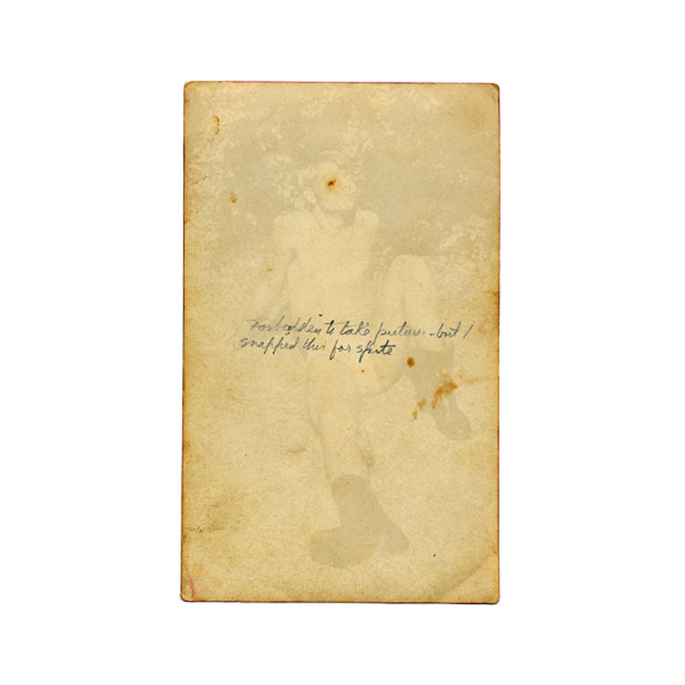
Melanie Willhide, ‘For Spite’
c-print, 24” x 30”
from ‘Sleeping Beauties (The Box Under the Bed)’, 2006

MW:  No you are not misinterpreting these issues as being important to me. I do agree that the early projects placed particular importance on what was not included in the frame. But the later works for me deal more with perception than nostalgia. In both my series Sleeping Beauties (the box under the bed) and The Belt of Venus, I intentionally create work where it is challenging to discern whether the image is authentic or fabricated by showing both the front-side and the backside of the image simultaneously. This layering creates a time lapse (much in the way abstract painting can) between initial sight and ultimate recognition.

Every part of these images is premeditated, including the front-side imagery and the notes and messages scrawled on the backside. There are hints that these are artificial artifacts in the production. Yet despite the use of recent technology to create something that looks antiquated, viewers are able to tap into the common human experience of the photographic image as memorial to a past love.  This is where I think nostalgia can be read into the work. Yet in reality they are devoid of any real experience or real information. They mimic the experience of an image found in a flea market, in which both the image and the text on the backside leave you puzzled as they perhaps fail to define either the subject of the image or the one who owned it. Inspiring these questions is, for me, the most exciting part of working digitally.

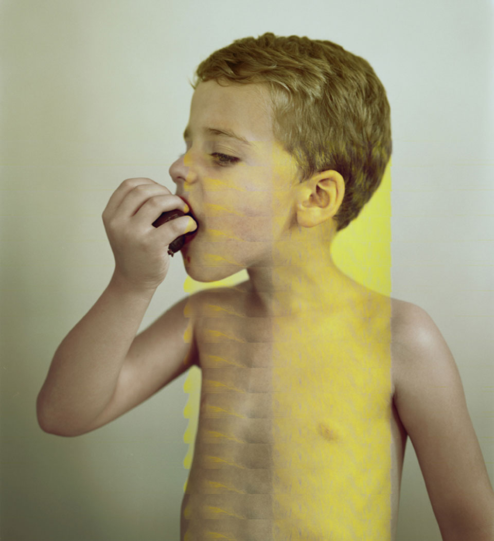
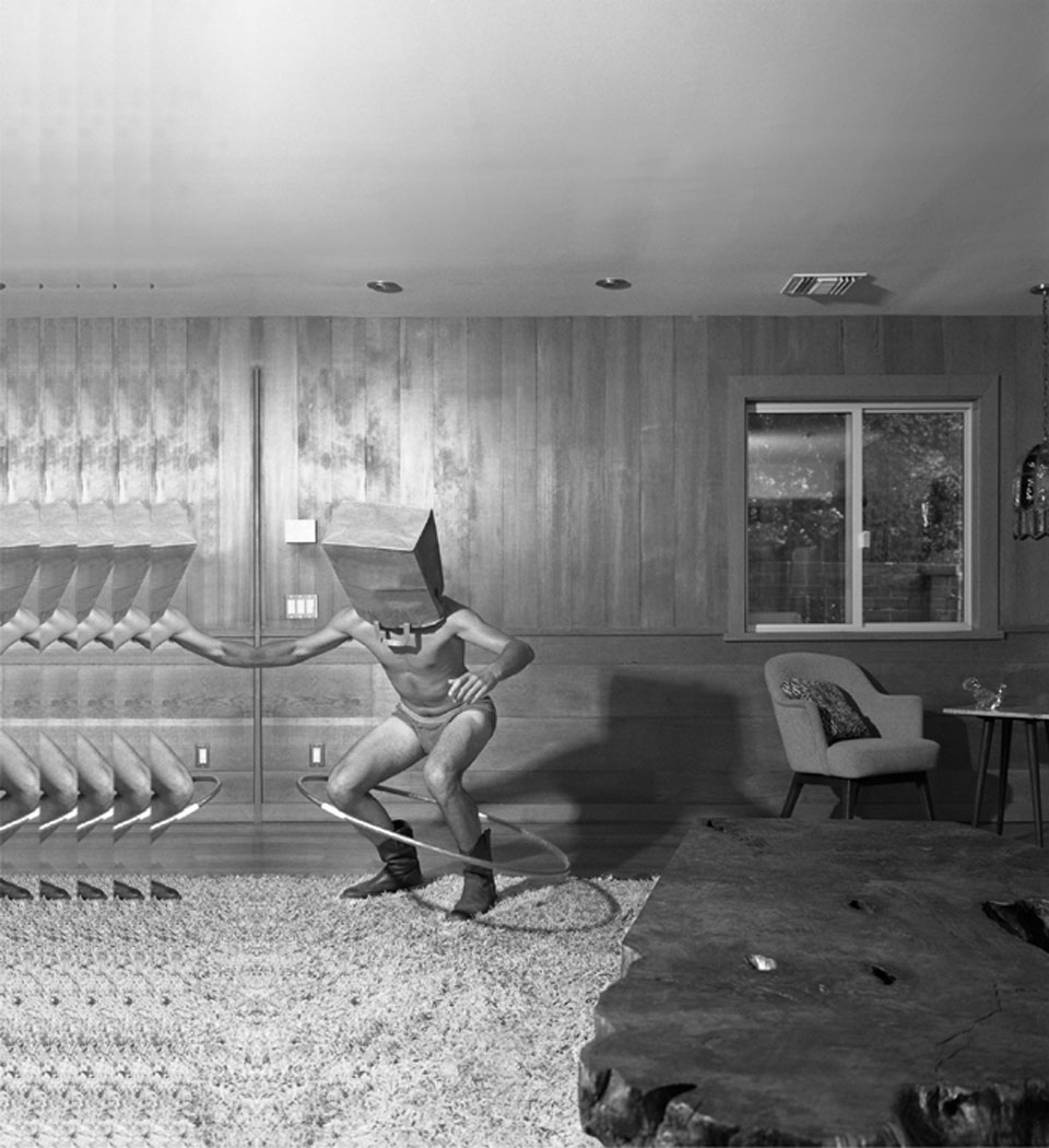
In my recent series To Adrian Rodriguez with Love, I simulate (with Photoshop) the language of the corrupted file. With Adrian, the work shifts the concern from the authenticity of an image’s subject to the image as a whole. Here the aesthetic language is more direct; the audience sees the image as well as its illusion (or the result of the failure of Photoshop’s mathematics) at the same time. To use your words – this series show the materiality of the photograph, as well as a nostalgia-inducing illusion.


Melanie Willhide, ‘Beefcake and Betsy’
archival pigment print 28×30″
from To Adrian Rodriquez with Love’, 2011
 
MAD:  Speaking of, your series To Adrian Rodriguez with Love, has received a lot of critical attention, deservedly so.  There is an almost mythical story about how the series came about. Do you mind retelling it here and then maybe talk about the moment in which you realized your loss could be an opportunity?  Perhaps it is still too early to tell, but did making this work change your trajectory as an artist?

MW:  My husband and I bought our first house in Altadena, California—a small town at the base of a state forest, above Pasadena—where cowboys and Cal tech professors live. I left for the day to manage the production of a commissioned piece for another artist in Los Angeles. When I returned to the house, it had been broken into. Items taken: two computers (including mine from my studio), a gold locket, a flat screen TV, and (to the haters) my backup airport.

I spent the next month dealing with a specific set of noteworthy characters at the Altadena Sherriff’s Department: one with a cast painted green with a black happy face drawn boldly on it, as well as some who appeared busy with things like whether or not to take a sweatshirt with them outside. All of them seemed to be eating sandwiches on Wonder bread. In other words, I was met with a host of roadblocks, beginning with the “book” where the details of my robbery had been “written” down having been lost. This continued for close to two months, until the day I stopped at the Sherriff’s station and the green cast-wearing woman told me the Pasadena Police Department had recovered my computer.

When I plugged the computer in I did not have a keyboard, so I was forced to look at the culprit and his girlfriend as a screensaver for a few days, until I could get another keyboard. Once I was able to access the computer I quickly found that my hard drive had been wiped, so I ran recovery software. This process took about 48 hours. When it was completed, my business partner and dear friend Betsy happened to be over. When we opened the files we found that many had been corrupted – family images of my nieces and nephews, wedding photographs, and all of the images I had been working on in two separate series. The first series was based on life saving manuals from the 1950s. These were created with a housing my husband designed so I could take my 4 x 5 camera underwater. They were romantic and played with perception through distortion.  The other a series of images, which I loosely called “Suburban Circus,” featured the talents that come out in the last hours of a great party. The work would not edit into exhibition. I had been struggling for some time to edit this work. But as Betsy and I moved the mouse over the recovered images it became clear that the corruption of the files unified the work. It made the work better. So inspired by the effects of the corruption I began to recreate in other photos using Photoshop.

Adrian changed my practice – not only in the appearance of my photos, but also in the very way I thought about images and how they were made. Ultimately, the experience helped me to more clearly identify continued themes in my work over the years and freed me to detach from my work, remain open and ultimately make it better.


Melanie Willhide, ‘Nate’
archival pigment print, 30×28″
from To Adrian Rodriguez with Love, 2011
 
MAD:  I like what you said earlier about the two concerns that have dominated your work “A dedication to making the image disappear in the photograph and the desire to challenge perception of the photograph through digital manipulation” I have a couple of questions related to that observation.  What is the difference between an image and a photograph?
MW:  I use the words interchangeably. Though if pressed to draw a distinction, I’d say “image” suggests something was made with consideration. But the word “photograph” implies something less measured, even impulsive in its conception.

MAD:  Through most of its history, photography explored what it meant to ‘see’ through the mechanical / optical  / chemical processes of photography.  Now, many contemporary photographers make work that involves ‘perception’. Do you think this the result of the difference between analog and digital image making?  Or, not to be glib but maybe its simply the fact that most photographic artists graduate from art schools and that this is a fundamental formal / philosophical question across all media?

MW:  No, I blame art schools for a lot of other things!  I do not think the shift in terms, from a “mechanical / optical / chemical” process to one that engages with audience perception, is solely the result of art school speak. I feel it is more related to the culture at large being more self aware and image-savvy than the early practitioners of the medium. Early practitioners who dragged bodies around during the Civil war to create an image of winning were perhaps the first photographers to tap into the idea that photography involves perception. Early audiences equated a photo with reality because it looked so much like what we see with our own eyes. In this way I don’t think the shift is at all related to analog and digital.

I would even argue that all artistic processes have a small period at their beginnings which simply showcases the mechanical / optical / chemical. Eventually, artists explore their perceptions (and those of the audience) through their aesthetics. Just look at the caves of Lascaux – those people must have first marveled at the mark before they decided to draw animals on the walls, right? That said, the push toward viewing photography as perception did have some help from academia, especially with the advances of psychology and feminism. Both introduced the idea that one could see the projection of power and desire.

Additionally, we now know the image to be a selection, and more often than not a modified selection at best. I might even argue that we are beyond the idea of images being modified – that culturally we rarely think about this – in the way girls wearing cutoff jeans so short the pockets stick out don’t think about the feminist movement that won them the choice to wear those shorts.


Melanie Willhide, ‘Poison Wings’
5×4″ c-print
from ‘Palindrome’, 2002
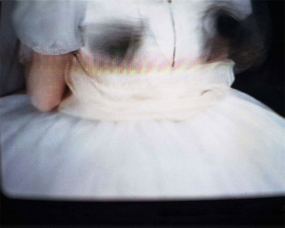
MAD:  I wanted to ask you about an earlier series of yours Palindrome.  On your website, I think there are nine images, perhaps there are more. In some ways, these pictures are your most ethereal. They are lovely, soft-focused and seem to have been taken off a TV, which creates a sense of distance. There is a kind of double-staging taking place as the images refer to dance, to ballet specifically, to the idea of performance. You were a dancer earlier in life, yes?  Can you talk about that history in relation to these pictures?

MW:  I trained for many years to be a ballet dancer. But in my late teens I endured a series of injuries that prevented that dream from being fully realized. I never exhibited this work, nor did I try to. The images are better discussed in terms of a timeline – they were made right out of graduate school. Tired and full of fear for the challenges of beginning a life as an artist, I turned my camera at something predictable – something I knew. I directed a view camera at a television screen playing videos of ballets I had danced: Swan Lake, Nutcracker, Coppelia, Romeo and Juliet, Sleeping Beauty there are a few images from a ballet I always wanted to dance, La Sylphide (a romantic ballet about love and the repercussions of the desire to possess another with the most gorgeous and tragic of endings). I have always staved off anxiety with nostalgia, but I had never made images out of this sort of nostalgia. I initially printed them very small and carried them in my pocket.

MAD:  In your pocket? For how long? I like that one might carry one’s art images around the way one might carry pictures of one’s children.

MW:  Or more like how a child carries a blanket around for security! I carried them with dedication for 5 months or so – and then only on occasion for the next 5 months after that.

Melanie Willhide, ‘Mike and Hula Hoop’
archival pigment print, 30×28″
from ‘To Adrian Rodriguez with Love’, 2011
MAD:  I really feel California in your To Adrian Rodriquez with Love project.  I think of movie stills, PR images, actor’s headshots.  There are swimming pools, body builders and women in bikinis.  You credit Adrian Rodriquez for the corruption of the images – but there is another kind of corruption here – that refers to California binaries – sunshine / noir, beauty / degradation, abundance / emptiness…

MW:  I just want to clarify that I credit Adrian with giving me the idea of recreating the look of the corrupted file in my series. I worked long and hard to create those images using Photoshop. I was very conscious of what corrupted files looked like from the recovered images – and I used that information as I created the images.  One of the great advantages of creating seemingly corrupted files was that act of adding an additional layer allowed me to integrate images that otherwise might seem random.

In response to the California binaries portion of the question – I have fallen in love with the body culture here in Los Angeles. It has feed my work since my move here from New York in 2004. At first I found the body culture to be both narrow and extreme in comparison to my east coast roots. Narrow in terms of what is acceptable and desirable (women have expiration dates, and men, who here in sunny southern CA are the new women – have them as well). Extreme in what people do to maintain the illusion (suddenly I had students whose fathers bought them nose and boob jobs as graduation gifts, I found myself at dinners with people who work on their minds with meditation while filling their faces with chemicals to stave off aging, a woman in a bagel shop gave me the stink eye for eating a bagel). It took me 3 weeks to find a model with full-grown pubic hair when I started the box under the bed series. In addition to spray tans, bleaching teeth and the anus, cars with tinted windows, bodies with no hair – I also found my life intersecting with the entertainment industry in odd ways – I had Anna Nicole Smith’s baby daddy in a course I taught and a Back Street boy relaying a message to me that he loved work of mine he had seen in Palm Springs. I thought I was floating around in outer space. I have just gone with it and loved every moment. Perhaps I was very attracted to this culture because of my years dancing – which had its own extreme set of rules regarding how the body should be. And the photographs that have resulted since moving here are like collecting spectacles – specimens – In the way an anthropologist might to study and understand.


Melanie Willhide
‘Trick #2 and Trick #4, Palm Springs, June’
archival pigment print, 30×28″
from ‘To Adrian Rodriguez with Love’, 2011

MAD:  In your series Sleeping Beauties and Belt of Venus you create false artifacts – allowing us to simultaneously view the front and back of what appear to be old photographs. Scribbles, folds, tears, tape marks, all add a patina of time and use.  It reminds me of what Marco Breuer says about photographs, that they are never fixed or finished that the life of a photograph continues long after it is taken and printed.  But yours are faux-evidence of photographic intimacy. Does this artifice matter? How does it change these pictures?

MW:  American life is so much about artifice. Right? For me photography is a type of artificial intimacy. A photograph of a person or an event can be surrogate for the real thing, capable of eliciting emotion similar to what the real person or thing would elicit. It is this willingness to emotionally succumb to the illusion of a photograph that informed the way I created the images for these series. I was making photographs that look like the images made between lovers and friends – those that are intended for the eyes of a single individual. This work is all about artifice – so it absolutely matters, thousand layer phyllo dough of artifice: artificial pictures, artificial subjects, artificial situations, and artificial text. All of this points to the illusion.

For me this is important because photo has long been measured by its ability to represent a reasonable facsimile of reality. It is this old way of measuring that has held the medium of photography hostage – preventing it from being able to play with its inherent property of illusion – say in the way painting is able. I am convinced that if more artists begin to work the medium of photo through programs like Photoshop that the photography would get that added push it needs to transform itself again and be free from the reigns of reality.

MAD:  I am curious about your titles – especially in The Belt of Venus series. They are so evocative, for example ‘How Can You Survive Without This Body?’ or ‘Can You See All the Swallows Nests All Along The Walls’ – I like the specificity of the questions and how they create oblique perspectives from which to view the images themselves.  Can you talk about how you think about the image / text relationship?

MW:  The titles for the images in both Sleeping Beauties (the box under the bed) and The Belt of Venus come from three sources; 1.) A poet and dear friend Jason Labbe (who published a chapbook of poems in 2009 called Dear Photographer) with whom I either collaborated, stole, or drew inspiration from, 2.) Love letters written to me over the course of my lifetime, or 3.) Text taken from the backs of photographs I purchased at flea markets. My rules with titles are they must be 1.) Slightly provocative – either sexually or politically – and 2.) Rather than answering questions – they must be capable of raising questions. I enjoy when titles or text on an images mimics the open-ended read of the image.

Melanie Willhide,
Can you see all the swallows nests all along the walls?’
9” x 9” c-print and 23 K gold leaf, from ‘Belt of Venus’, 2007

Wednesday, June 6, 2012

MARCO BREUER | Modern Art Notes — Interview with Tyler Green [Podcast]


This week’s Modern Art Notes Podcast features New York-based artist Mickalene Thomas. An exhibition of Thomas’s recent paintings, “Mickalene Thomas: Origin of the Universe,” is on view at the Santa Monica Museum of Art through August 19.

Thomas has exhibited in the U.S., Europe and Asia. Her work is in the collections of numerous museums, including the Museum of Modern Art, the Baltimore Museum of Art, the Brooklyn Museum, the Nerman Museum of Contemporary Art and the Smithsonian’s National Portrait Gallery.
On the program Thomas and I discuss:
  • Her earliest memories of seeing art;
  • How she came to make art history a key subject of her work;
  • Her relationship with her mother and how her mother came to model for her; and
  • The importance of photography in her process.
Marco Breuer, Untitled, 2012.

This week’s second guest is New York-based photographer Marco Breuer, whose latest work is on view now at Chelsea’s Von Lintel Gallery. Breuer’s manipulations of photographic paper create fantastic, often surprising abstractions.
 
His most recent museum exhibition was last year’s “Marco Breuer: Line of Sight,” which was organized by Julian Cox at the de Young in San Francisco.His work is in the collection of the Baltimore Museum of Art, MoMA, the Albright-Knox Art Gallery, the Harvard Art Museums and SFMOMA.

To download or subscribe to The Modern Art Notes Podcast via iTunes, click here. To download the program directly, click here. To subscribe to The MAN Podcast’s RSS feed, click here. You can stream the program through the player below.

The Modern Art Notes Podcast is an independent production of Modern Art Notes Media. It is released under this Creative Commons license. This week’s show was edited by Wilson Butterworth. For images of the works discussed on this week’s show, click through to the jump.

MARCO BREUER | 'Condition' — Review on Aperture's Exposures Blog


Footage from the opening reception at Von Lintel Gallery. Courtesy NYC Gallery Openings.

Marco Breuer, otherwise known as the “photographer without a camera,” has built a strong reputation over the course of the last 20 years exploring lens-less “photogenic” art. While many photographers today are employing more and more complex technology in their work, the German conceptual artist and 2006 Guggenheim fellow says his is an “ongoing attempt to strip down the photographic process, to remove the distractions of equipment, and to force imagery out of photographic paper itself.”

His latest solo exhibition Condition (on view at Von Lintel Gallery through June 23, 2012) presents work he made in and out of the darkroom, stressing photographic paper by exposing it to heat, light, and physical abrasion with “coal, sandpaper, heat guns, burning swaths of cotton, electric frying pans, and other unexpected objects,” as one interviewer catalogues.

Ranging from small photographic sketches, to larger 30 by 40-inch prints, “every individual piece constitutes a search, a move away from the given, a test of the materials’ limits,” the press release states. He fuses image and medium, “rendering them inseparable, one and the same.”

In 2007, Aperture published his monograph Early Recordings, the first comprehensive look at his boldly experimental work, alongside a limited edition slip-cased book which comes with a unique-to-each-edition Polaroid print. His work is also featured in Lyle Rexer’s sold out book, The Edge of Vision (Aperture 2009).

Read John Yau’s review of Breuer’s solo exhibition on HyperAllergic. View installation shots and photos from the opening reception on May 10, 2012 on the Von Lintel Gallery blog. And read interviews with the artist about his work on ARTLOG and on MPR.

Read more @ Aperture

Thursday, May 10, 2012

MARCO BREUER | Featured Interview — ARTLOG

Marco Breuer: Photography Without a Camera

Tiffany Jow

Proportional_710_bm12_c-1178_300
Marco Breuer,  
Untitled (C-1178), 2012
chromogenic paper, burned. 
Courtesy of the artist and Von Lintel Gallery, New York.
Over the course of his twenty-year career, Marco Breuer has made a name for himself as a camera-less photographer. Less concerned with how photography captures a subject and more with the uncharted territory in the very materiality of photography, the conceptually driven German artist uses coal, sandpaper, heat guns, burning swaths of cotton, electric frying pans, and other unexpected objects to lacerate photographic paper in various ways. The exquisite results mimic constellations, explosions, midnight city skylines, tie-dye, and other natural wonders that expose every detail, abrasion, and color shift. Unlike traditional photographs, Breuer’s are truly one of a kind.

Von Lintel Gallery unveils Breuer’s latest series on May 10 in an exhibition titled Condition. Here, photographic color paper is manipulated with heat, light, and manual scouring, making way for new colors and electrifying effects. Photographic sketches and slashed thirty-by-forty-inch prints will also be on view. We caught up with the artist on the week of the show’s opening to learn more about the exhibition and what led him to his distinctive examination of photographic practice.

How are these works different from what you’ve done previously?

They are part of an ongoing attempt to strip down the photographic process, to remove the distractions of equipment, and to force imagery out of photographic paper itself. I am interested in the intersection of photography and drawing: the negotiation of the illusionistic space of photography versus the concrete space of the physical mark.

How did you achieve the electric blue color that dominates much of the show?
The blue is the chromogenic paper’s response to the orange glow of the heating element. In the vast majority of works I do not chose colors: they are the result of the parameters I set. When I have to make a choice, as in a contact print, I try to make it not about color, like dialing 0/0/0 in the enlarger.


Marco Breuer
Untitled (C-1166), 2012
chromogenic paper, exposed, folded, burned
Courtesy of the artist and Von Lintel Gallery, New York.
 

Do you feel misrepresented when people refer to you as a photographer?
Not at all.

How did you first come up with the concept that now drives your methodology of art-making?
After six years of photography school I had heard every rule in the book. While that was helpful for a solid technical grounding, it did get in the way of true exploration. My 100 Tage thesis project was an attempt to get all of that education out of my system. I tried to literally make all those images stored in my head, to get to the point where I had to dig deeper, could no longer rely on what I knew (or had been told). Ultimately, I needed to tweak the medium of photography to make it work for me, shift from the standard mode of illustration of preconceived notions to an actual investigation of the conditions of the photographic medium.

Read full interview @ ARTLOG

Wednesday, March 7, 2012

YVONNE ESTRADA | 'Blue' — Burning Ambulance Review

Above, L-R: Yvonne Estrada, LD6-07; Anna Atkins, Himanthalia Lorea; Eduardo Souto de Moura, Silo Norte Shopping

By Izalia Roncallo

"In recent years, drawing has assumed an expanded and more independent role in the art world. For a long time, drawing was seen by many as a transitional phase in the creative process, leading to the eventual production of a larger piece, for example a painting or a sculpture. But today, drawings’ subjects are not limited to figures or landscapes; in fact, it seems that contemporary drawing is fascinated with dealing with the nature or essence of drawing itself. 

In Yvonne Estrada’s recent works, collectively titled Blue, abstract ultramarine and cobalt forms are produced that have a painterly element to them. The painterly element of this group of images comes from the use of blue gouache and watercolor, in some cases running down the image in streaks. Multiple drawing instruments are employed—graphite, felt and ballpoint pens—while techniques like crosshatching, contour lines, circles and scribbles create dimension, tonal value and texture, features generally associated with drawing. The gestural markings are simple and layered from thick to thin lines to build up a biomorphic image. Estrada is crossing media boundaries with her combinations of painting and drawing methods.

At times, her abstract forms are organic, and may resemble a flower bud or a leaf. In a way, the images are reminiscent of cyanotypes, not only because of the strong use of blue but also because of cyanotypes’ early history as a way to depict organic specimens. For a counterexample, look at the images of Anna Atkins. Atkins’ technique makes details lessen, so the image is an outline of the flora. This is not the case with Estrada, however, whose forms are not necessarily flowers or leaves—in fact, they are complex abstract shapes with intricate detail. In an interview with Stephanie Buhmann for The Villager, Estrada explained that the blue of these works is a nod to architectural blueprints.

"I always wanted to work with architectural blueprints, as I love their powdery, purplish blue lines," she said. “In some ways these works reflect my affinity for these documents."

But there are no rectilinear forms to see in her work; the only evidence of a blueprint is the way all forms connect to one another on the paper, creating a cohesive shape. Still, while Estrada's images are abstract and at times have an unfinished quality about them, there is order to the chaos, even if her shapes look randomly placed. Every spot, stain, smear or streak Estrada makes is calculated. A large work can take up to six months to a year to complete.

In one way or another, everyone has participated in the medium of drawing; still, to see the theme of nature explored in a different way is always appealing. The labor-intensive shapes of Estrada's Blue present an intimate and personal view of nature that is much appreciated after the development of construction teams working on images together, as in the drawings emanating from Robert Longo's studio. No matter what style of drawing the viewer may enjoy, there is something for everyone since the medium is unrestricted, and this is a reason drawing is filling up museum and gallery walls. Yvonne Estrada’s work represents just one more way that drawing is developing."

Read original post @ Burning Ambulance